by successfulbob | black & white, musician photography, people photography, photography, photography education, photoshop tutorial
If you send out press releases or images for ads that will be appearing in newspapers I highly recommend a few steps to ensure that you get good looking images when the paper goes to print.

Eric Miller image converted to black and white using the LAB mode in Photoshop with a curves bump.
Number one – Do not send a color image unless it is possible the image is going to be printed in color. Many times in the newspaper world since they are on deadline and shorthanded the conversion from a color image to black and white is to desaturate the image. Period. There is no consideration for the tones or where they fall or what colors are going to come forward. I highly recommend using a method I have made with a Photoshop Action.
Convert the file to LAB Color Mode In the Channels Palette Select the B Channel and Delete it. Then Select and Delete Channel Alpha 2. Convert the file to Greyscale Mode. Convert the file to RGB Mode. Add a Curves Adjustment Layer. Pull down on the 3/4 tone and up on the 1/4 tone in the Curves Dialog box adding contrast to the image.
This makes for a pretty clean BW and with the Curves Adjustment Layer you can make changes to the highlights and shadows if necessary before saving the file. If you would like this action already complete rather than building it yourself send me an email and I’ll get it to you.
The other thing that will help your image stand out in newsprint is to sharpen your image until it almost looks too crunchy on your screen and when printed with the spread of ink it will be sharp in print. If an image is not ‘over sharpened’ this way the spread of ink will make it look soft. Here’s what I do…
Flatten the image. Go to Filter > Sharpen > Unsharp Mask with these settings – Amount 500% Radius 1.7 Threshold 7. Your image will look frightening! Wait there’s more… Go to Edit > Fade Unsharp Mask Change the Mode to Luminousity and fade to 40% Opacity. Your image will look a bit sharp but will print beautifully on newsprint at these settings. Want that action? Email me.
Conversion and sharpening will make your images stand out from the rest…
Yours in Creative Photography, Bob
by successfulbob | black & white, fine art portrait, Lumix GX7, Lumix Lounge, people photography, photography, photography education
As I was having lunch in Durango, Colorado I noticed the animation of our bartender. I explained that I was a photographer on a busman’s holiday and would she mind posing and giving me a few different expressions? She agreed. I had an image pop into my head that is like something below.
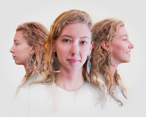
This is in process. Thoughts??
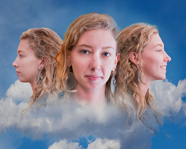
Adding some clouds…
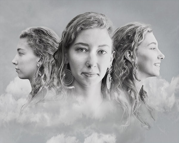
Black and white version.
Feedback invited. Working title is ‘Three faces of Libby’.
Image captured with the Lumix GX7 and the 35-100mm f2.8 Vario lens. It’s a very compact camera that is not intimidating to those who you wish to be subjects on the fly…
Yours in Creative Photography, Bob
by successfulbob | photography, photography - art quote, photography education
John Sexton creates exquisite black and white photographs. He worked with Ansel Adams for a number of years through 1984 at the time of Adams passing. Today’s quote invites us to think about the creation of an image after the capture. Unless you have complete control over the lighting there is no way a camera can replicate what the eye can see and work after teh fact can help express what was seen by the photographer.
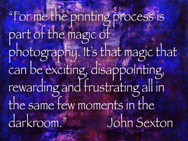
“For me the printing process is part of the magic of photography. It’s that magic that can be exciting, disappointing, rewarding and frustrating all in the same few moments in the darkroom.” John Sexton
I understand this well. I remember trying to pull a good print after hours of trying differing amounts of dodging and burning in the darkroom. And as they said on the ABC sports commercial feeling, “…the thrill of Victory and the Agony of Defeat…”
We now have the ability to be able to process the images in a repeatable fashion using the computer and software programs. The possibilities of creating the image in our ‘minds eye’ is better than ever. I often hear newer photographers say I want to have the image ‘natural’ as it comes out of the camera. Using artificial lighting or Photoshop techniques is ‘cheating’. I suggest that these photographers have yet to understand that the camera does not record as the eye sees and that there is a need to make allowances for that in order to get the 3 dimensions in front of our eyes represented in two dimensions on the print.
There is also the point that many decisions have already been made that distort reality by the photographer choosing what lens to use. How the view is cropped in camera. What aperture and shutter speed were chosen. The time of day the image was made. All of these choices are already ‘cheating’ what another person would see if they were on the scene. Also remember the eye has the magnificent ability to open and close its aperture (pupil) depending upon where it is looking in the scene. If it looks to the sky it instantaneously closes down to see detail in the bright white but will immediately open up to allow shadow detail to come forward. The camera only has one aperture to look through.
So I ask this question. Are you a natural light photographer who doesn’t want to cheat as I was when I first started? Or, are you a professional photographer willing and able to learn and use all the tools available?
Yours in Creative Photography, Bob
by successfulbob | fine art photography, graphic design, Lumix GX7, Lumix Lounge, macro, photography education, photography gear
The flower garden at the B&B at which I’m staying has some beautiful blooms… So I’m playing and experimenting with the Lumix GX7, 35-100mm f2.8 and and Vello extension tubes.

Rose petals close-up with extension tubes. Opening up the shadows and lowering the highlights with the GX7’s in camera curves setting.
I always enjoy details revealed when photographing flora with back lighting.
Have you played lately??
Yours in Creative Photography, bob
by successfulbob | architectural photography, black & white, fine art photography, Lumix GX7, photography, photography education
Camera presets.
Never used them with any success before getting into the micro 4/3rds system with Panasonic Lumix cameras. I’m out on holiday in Santa Fe, New Mexico and putting the Lumix GX7 through it’s paces. One of my favorite presets is Illustrative Art. But, with a tweak. Turning it to black and white. It leads to a high contrast image with a bit of a glow on the highest contrast areas. Here take a look at these images…
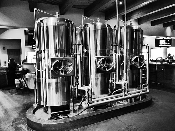
Copper tanks at the Blue Corn Cafe & Brewery Restaurant in Santa Fe, New Mexico
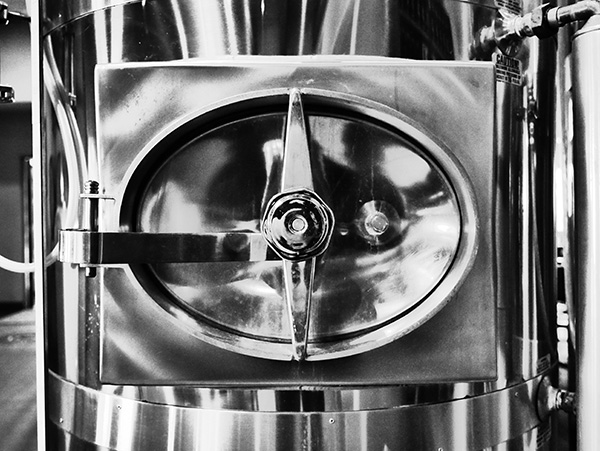
Copper tank handle detail. Love the shape and form that comes forward using this technique.
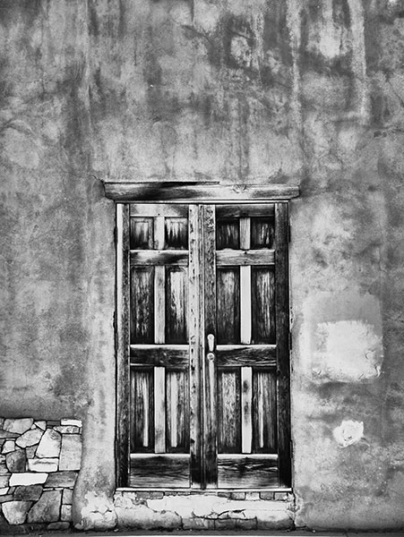
Downtown Santa Fe door and wall with wall. Textures galore!
One thing to remember when using in-camera presets is to save images as a jpeg. I usually shoot in RAW plus jpeg so I can have the best of both worlds. If you only save in RAW you will see the processed black and white image on the back of your camera and upon download momentarily on your computer as the viewing jpeg info is stripped away leaving you only the RAW information.
Travel is a great way to get the creative juices flowing… When and where is your next road trip?
Yours in Creative Photography, Bob
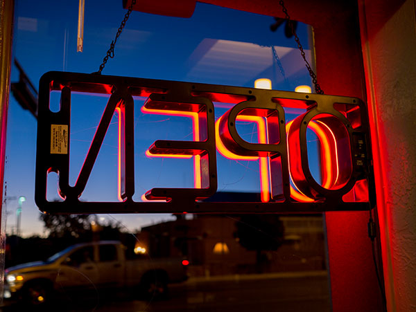
by successfulbob | Lumix GX7, Lumix Lounge, photography, photography education
Are you open to PLAY!??
Play means time to learn and test. On a road trip and looking out the window and you know how much I like neon and the back of this open sign invited some attention from the Lumix GX7 and the 20mm pancake f1.7 lens. This is a very low profile set up for street photography. Here’s a couple…

I really liked the Orange glow against the blue sky.
Different angle leads to different feeling in the photo.

And flipping the image changes things totally.
How do you play? Are these award winning photos? Nope. But I learned a few things playing with color and exposure that will help me in the future…
Yours in Creative Photography, Bob