by successfulbob | fine art photography, fine art portrait, people photography, tuesday painterly photo art
Tuesday Painterly Photo Art
Heather Michelle Chinn – AKA “Heather the Painter” Corel Painter Master Elite, Corel Certified Painter Educator, Golden Artist Educator, M.Photog, M.Artist, CR.
Completely captivated!
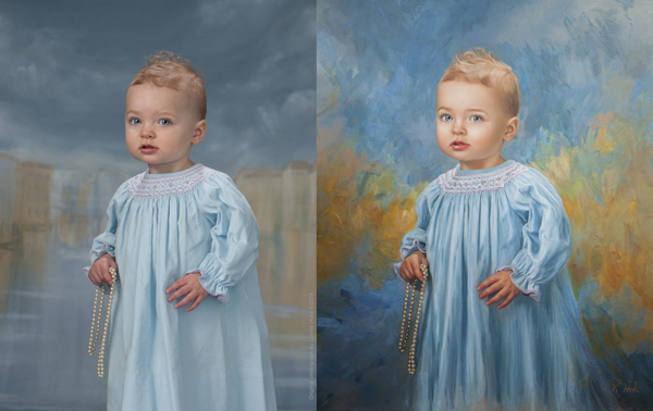
Came across the first image in this post when I was judging an imaging competition for Professional Photographers of America (PPA). It was obviously in the Artist category, but it was such a fantastic portrait that contained an incredible personality. I loved it! Great skill was needed to make this fantasy piece believable.
I have since been exposed to more of Heather’s work, and she shows why there are so many credentials following her name. Another image, in an entirely different style, cemented the fact I wanted Heather to be featured in this blog about Painterly Photo Art. I won’t tell you which image, but know that “Leo” is one of my all-time heroes in the art world. Here’s Heather.
Learning Corel Painter
Creatives wanting to learn Corel Painter, and traditional oil/acrylic painting often ask what they can study to learn how to produce stronger paintings. Studying traditional artwork in a style that moves you is the key! Look at the same elements used to judge the International Print Competition** and you can see how it translates into a more PAINTING-focused list:
Here we go!
Impact – Does this grab the viewer/collector for a long time and stir emotions by using the following elements?
Technical Excellence – Are your brush strokes varied to a degree where not everything looks like mush, or “matchy-matchy?” How are your shadow/highlight transitions accomplished in blending or laying varying levels of colors next to each other? Is the texture interesting and supportive? Are the brush SIZES supporting and appropriate? Are objects correctly proportionate?
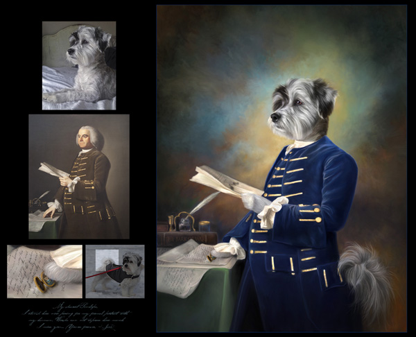 “Letters to Penelope” © Heather Chinn Photography
Creativity – Is this something “new” that viewers/collectors haven’t experienced before? Is it a different take on a theme?
Style – Does your heart and soul show through your art? Is it an accurate expression of the real you? People can tell. If it’s you, it shows.
 “Defiant” before/after © Heather Chinn Photography
Composition – Does the layout of choices such as value range, lines, subject shape weights, etc. support your story? Does it keep the interest of the viewer without them knowing why?
Presentation – Is it presented in a way that best supports the painting? IE: Frame choice? Hanging height with lighting choice? I rarely use thin frames, and try to find frames that are at least 4″ in width or matches the subject’s face size. Is it best presented on paper or canvas? Watercolors, pastels, charcoals, and more modern interpretations read beautifully on papers. I’ve found traditional paintings are best received on canvas. It’s up to your style and taste. Is it hung at eye level? Is it well lit?
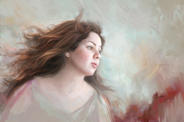
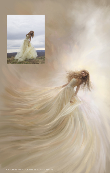 “Elysium” © Heather Chinn Photography Original photograph Tammy Bevins
Color Balance – I believe this is crucial to a painting being successful. If you look at well-known pieces by the Masters such as Monet’s waterlilies, John Singer Sargent’s portraits, or the brilliant works by Vermeer, you’ll see not every color in the spectrum was used. That can be overkill unless it aligns with your style (more modern). The aspect of BALANCE is of paramount importance. Are the colors overall easy to view for a long period, or does the saturation scream at you? Does the harmony and balance of colors playing together work to support the message? If you look at a Sargent portrait and take it into Photoshop and look at the colors used, you’ll find very few super saturated colors are used. Saturated colors were reserved for pops of “surprise.” Limit your “aha!” color moments for a more pleasing, easy-to-look-at-for-a-long-while masterpiece.
This links to an excellent post on color theory: http://www.oil-painting-techniques.com/color-theory.html
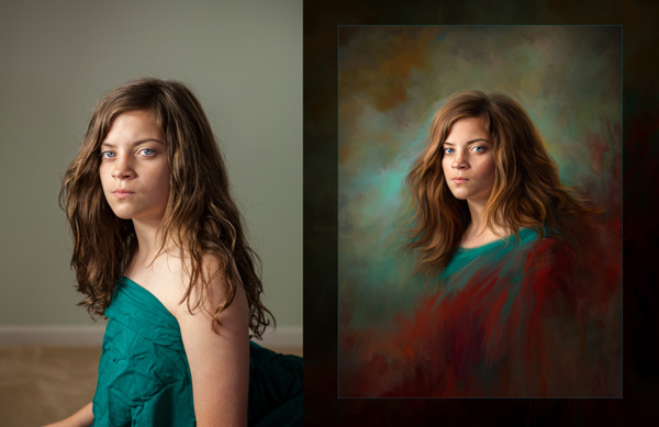
 “Culvarious” before/after marketing piece – © Heather Chinn Photography
Center of Interest – This absolutely has to support your story. What are you trying to say to the viewer? Is it about the portrait of the face, or maybe a secret message about the surrounding props? Leading lines, lighting choices, highlight placement/shadow placement can all subconsciously lead the viewer here. Brushwork can also lead to the center of interest by refining your strokes and intensity of detail into the area you want the viewer to “land” and stay awhile.
Lighting – This absolutely must support your story, again (seeing a pattern here?). Dramatic lighting on a fresh newborn baby speaks of ominous tones or dramatic backstory. If you study the popular Old Masters paintings, you may notice two things: direction lighting (versus flat lighting), and an element of backlighting make for STUNNING paintings. Flat lighting is harder to paint, in my opinion. There is no clear definition of highlight placement. It works for some artists. For me, I tend to love clear, defined highlights that come with direction lighting, and a backlit/hair lit portrait. Is the lighting the most flattering to your subject?
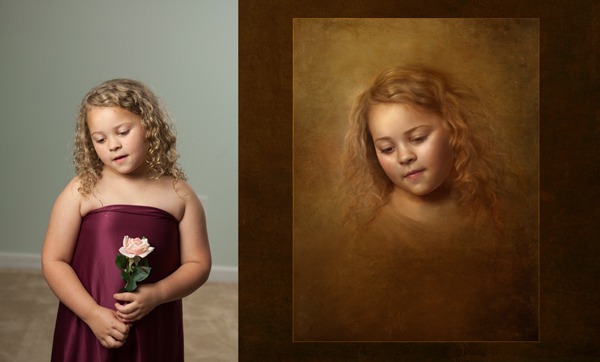
 “Divinely DaVinci” – © Heather Chinn Photography (This image ROCKS! ED.)
Subject Matter & Story Telling – These are pretty self-explanatory! What the heck are you trying to convey in your artwork? Is it clear?
Technique – Balance your colors. Balance your brush texture. Varying degrees of blending/hard edges will make for a very interesting painting. There must be some tension of contrast between your elements.
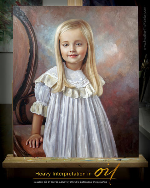 “Oil Interpretation Marketing Piece – © Heather Chinn Photography
Heather’s Extra Tips
I would recommend getting lost in art museums, gallery showings, Pinterest, Behance, and playing with paint! Take screenshots of images that move you. Put them in a single folder, and then go through this list trying to find similar elements between your favorite artwork? Do you find you’re drawn to more monochromatic paintings? More bold colors? Flat lit? Directionally lit? Strong lines, or soft, blended, peaceful scenes? Is there similar brushwork? Is there a dominant color family consistently used? Is there a consistent subject matter?
Maybe if you can find similarities, you can apply those to your masterpieces! Even if you don’t paint in your studio, when applied, these elements will grow your portraiture.
 Heather’s Headshot – © Heather Chinn Photography
Happy painting, Heather
———————-
Heather Michelle Chinn was born with a paintbrush. From early on she would paint anything with any medium within reach from food to nail polish. Her earlier masterpieces were painted inside closet walls and eventually translated into professional murals in Fredericksburg, Virginia. For several years, Heather painted whimsical watercolors for the international stationary company Mon Petite Chou.
Heather is an experienced presenter in live and recorded demonstrations. She has been teaching Corel Painter and mixed media at multi-day workshops, live seminars and webinars, and PPA affiliate schools all across the country for the last eight years. Known for what is consistently called her “calming” manner of speaking, being graceful under pressure, concise and thorough, with easy-to-follow Corel Painter tutorials. Heather is a natural educator across multiple platforms.
Two of her ethereal paintings of children, “Little Miss” and “Not A Girl, Not Yet a Woman,” were featured among 135 artist’s work out of thousands of entries in Ballistic Publishing’s first Painter book. Heather’s masterpieces are consistently featured in the prestigious, annual PPA Loan Collections where only a small percentage of the world’s best photographic artwork is selected among thousands of entries. Interviews and artwork have been featured in multiple Showcase Collections, French Photography Magazine, Digital Photo Pro UK, After Capture and the Official Corel Painter Magazine. Recently, Heather’s work and collaborative efforts have been published in Painter Showcase, a collection of several worldwide digital artists’ masterpieces available at Amazon.com. Her belief that anyone can easily use Corel Painter to create their own keepsakes led her to a speaking platform at the beautiful Phoenix Symphony Hall for the Professional Photographers of America’s International Convention in Phoenix, Arizona in January 2014. Heather made her television debut on Lifetime Television’s “The Balancing Act” in April of 2014.
When Heather isn’t creating oils and mixed media paintings for her photographer clients, or retail collectors on the easel, she travels the country inspiring and mentoring the budding or professional creatives in mixed media and figurative expression. Her time is devoted and divided between painted commissions, and education. It is said that Heather’s “soul” is often very clearly seen in her work. Her elegant brushwork and transcendent color harmonies capture the ethereal essence of the subject and evoke an emotional dialogue between viewer and painting.
To learn Corel Painter, please visit Corel’s vast library of free tutorials at www.Youtube.com/PainterTutorials
Please subscribe to my Youtube channel at www.Youtube.com/HeatherThePainter
Be sure to subscribe to the newsletter at www.HeatherThePainterStore.com for updates on webinars and workshops! There are in-depth tutorials of step by step training on www.HeatherThePainterStore.com. Heather is available for digital painting and acrylic/oil embellishing private and group workshops, private online training, and speaking.
The top two tutorials that help people who have never used Corel Painter, or have never PAINTED before are the “Intro to Painter” and “Portrait Box Set” available for immediate digital download at www.HeatherThePainterStore.com
Deals for Successful-Photographer readers from Heather until September 1st, 2016
“save25” saves $25 off the new Classical Remixed Backgrounds Collection (even if it’s on sale)
“successful” saves you 20% off any tutorial training (even if it’s on sale)
www.HeatherThePainterStore.com and www.HeatherThePainter.com
Yours in Creative Photography, Bob
** PS – Heather’s post comes at a great time and talks about the twelve elements as used in International Photographic Competition (IPC) Judging starts this Sunday and you can watch the process live. Fabulous education even if you haven’t entered images this time around.
International Photographic Competition
Welcome to IPC Live, streaming July 31 – August 4, 2016. Everyone is welcome to watch! If you are a PPA member, login with your username and password. If you are not a member, create an account below, and enjoy the show! Here are the showtimes:
IPC Judging Live Stream: Sunday, July 31, 4:30 pm – 6:30 pm EST; Monday, August 1 – Thursday, August 4, 8:00 am -6:00 pm EST
IPC Live hosted by Booray Perry, Cr.Photog., CPP: Monday, August 1-Thursday, August 4, 10:15 am & 2:15 pm EST
Save
Save
Save
Save
Save
by successfulbob | fine art portrait, people photography, photography - art quote
Sunday PhotoArt Quote – Chuck Close
Some people know how to smack you upside the head in just a few words.
I often find that the fewer the words often, the higher the impact.
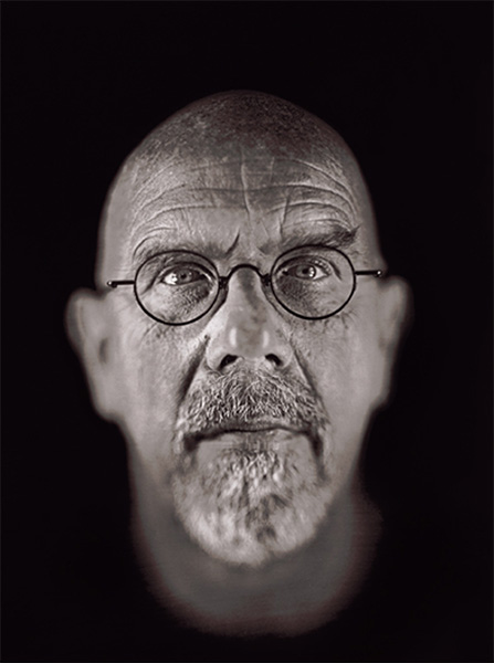
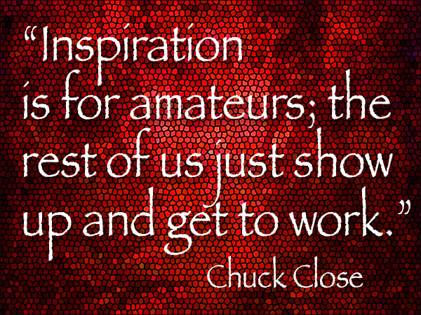 “Inspiration is for amateurs; the rest of us just show up and get to work.” Chuck Close
Pretty sure I have used this quote here before but I believe it bears repetition. If you wait for inspiration to strike you could well be standing on the platform when the train travels past leaving you behind. In my study of artists of all types in looking for inspiration I find that in almost all genres including writing, painting, sculpting and photography, the advice most offered to becoming a stronger artist is just to do it. Of course, you want to practice well but just getting in there and producing whether making mistakes or masterpieces will move you down the road to becoming more proficient at your craft.
 Daguerreotype – Self-portrait © Chuck Close
Chuck Close was one of the photographic artists who inspired me with a larger than life portraits printed on various strata. Even though he suffered a spinal artery collapse that left him paralyzed he kept working and painting creating photo-realistic work that continues to inspire me today.
Time to get to work. I still need more practice.
How about you?
Yours in Creative Photography, Bob
Save

by successfulbob | fine art musician portrait, Lumix GH4, Lumix GX7, Lumix Lounge, musician photography, people photography, photographer of musicians
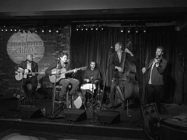
Photography of Musicians at Sound Bites Grill
The Black Market Trust
Photographing musicians during a live performance can be a bit of a challenge.
But I dig it!
If you follow this blog you know I am charged with creating the marketing images for bands who play at Sound Bites Grill in Sedona. Also, the ‘Wall of Fame’ is a record of performers who have graced the stage and is becoming a history of entertainment at the restaurant. To date, there are over eighty art pieces presented on the wall.
Here is the latest.
 The Black Market Trust Band
 Here is the finished piece as presented on the ‘Wall of Fame.’
While the band is performing, I isolate each member and extract them from the scene and then blend them back together while creating the art piece for the wall. These were captured with the Lumix GX7 and the 35-100mm f2.8 Vario lens. After each member is placed on the new canvas layers of texture, drop shadows, and lighting effects are added to create depth and dimension.
While the musicians are on site, I gather their ‘message to the house’ and autographs for inclusion in the final art piece. These are signed in black Sharpie on white paper. After scanning, using Adobe Photoshop they are imported to the final image, sized and inverted to white text. The Blend Mode of the Layer is changed to Screen. This makes the inverted paper, which is now black disappear with no further selections necessary.
Images for the newspaper are also prepped. I shoot in color but do the prep to black and white for the best printing results. Many times a color image is just changed to greyscale by the paper and using NIK Silver FX Pro 2 makes for better contrast and tones. These were captured with the Lumix GH4 and the 12-35 f2.8 Vario lens.
 Black & White photo The Black Market Trust Band
 Color image of the BMT Band
Yours in Creative Photography, Bob
Save
by successfulbob | black & white, infrared photography, landscape photography, people photography, photography education
Infrared Photography – Some Members
of Infamous Mopar AZ Chapter Car Club in Sedona
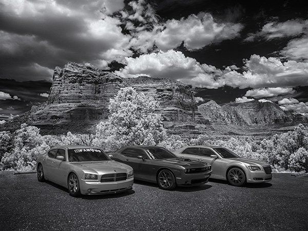
You never know who you might run into when you are out photographing clouds. While I was catching some infrared photos at Bell Rock Vista in the Village of Oak Creek in Sedona, three pretty cool cars started backing into spaces right behind me. When I realized they were lining up to take photos of their cars I moved out of their frame.
We started to chat, and it turns out we have a lot in common. They are members of the Infamous AZ Chapter Mopar Car Club, and I once had a cat I named Mopar because of the way she purred. OK, I have a weird sense of humor, but you get used to it I think. I believe all people are connected in one way or another.
Since the cars were lined up, I captured some photos with my infrared set-up. (see this post on processing infrared files from this session)
Here are a couple of captures.
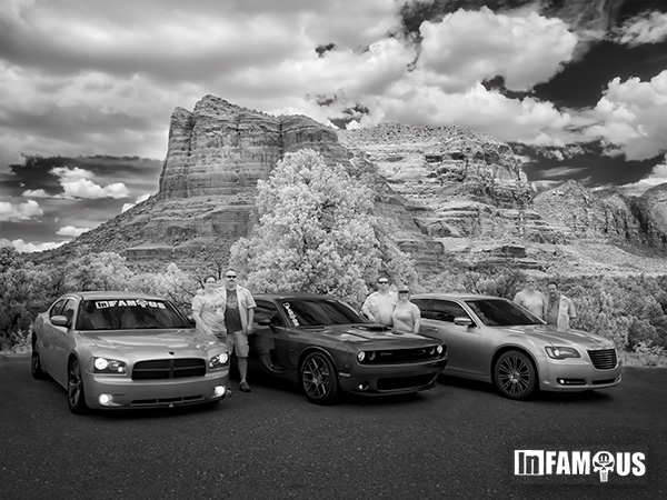 Three couples from the INfamous Mopar AZ Chapter
The three couples I met while photographing with my infrared Lumix G6 camera at Bell Rock Vista. This image was processed in the same way as was described in the other post.
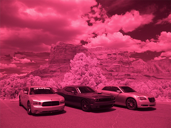
 Cars from the Infamous Mopar Car Club AZ Chapter in front of Courthouse Butte in the VOC, Sedona
 Straight out of Camera (SOOC)
This image was processed in a different manner from the on above. I started with the RAW file. In infrared converted cameras, the RAW image will have a severe magenta cast.
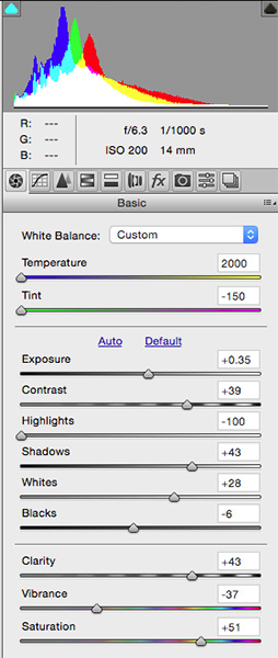 ACR Palette with settings
First stop was into Adobe Camera RAW for initial processing. Settings were to move the Temperature Slider all the way to Blue. The Tint Slider all the way to Green. Exposure boosted 1/3 stop. Contrast increased. Highlights were lowered, and Shadows raised. Whites bumped up a bit, and Blacks brought down. A small amount of Clarity was added, and Vibrance was lowered. 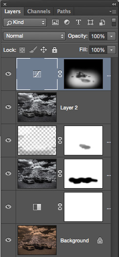
Adobe Photoshop Layers Palette
The Background Layer shows how the image comes out of Adobe Camera RAW with the processing shown. It is quite a Sepia tone which cold be OK but not the look for which I was going Above that is a Black & White Adjustment Layer. Next up, is the Layer generated by a trip to NIK Silver FX Pro 2. (available free of charge from Google) It created the full black & white conversion. I added some structure, grain, and controlled the intensity of the black and white. There’s a Layer Mask to allow some of the original image to show through without the processing from NIK. Above that is a Layer in Soft Light Mode for dodging and burning. The top Layer is a Curves Layer to allow some selective lightening of the image to bring some extra attention to the cars.
I think these infrared images would look great printed on metal.
Yours in Creative Photography, Bob
Save
Save
by successfulbob | photography, photography creativity, photography education, tuesday painterly photo art
Tuesday Painterly Photo Art
John Hartman, M.Photog.Cr, CPP, A-ASP, EA-ASP
Jealous.
If I have one word to share about John that would be it. I am jealous of his ability to absorb information and ideas about photography and photographic arts and then find a way to earn income from it. John has been sharing his photography and business knowledge for over thirty years and he’s still breaking new ground on a regular basis.
Throughout his 42-year professional career, this Wisconsin-based photographer has made it his life and business mission to find out what everyone is doing and then doing something different. One of his recent personal projects has been mastering the art, science, and business of the technique of painting with light. Exposing dozens or sometimes hundreds of separate shots with continuous LED lights and then blending them together in Photoshop, a light painted photograph simply looks like no other image.
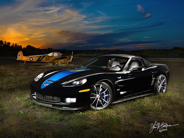 All images in this post are © John Hartman. Light painted art.
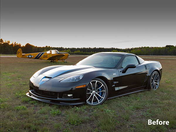 Before Light painting
Once the process was mastered, he began testing the commercial viability of this new product. Clients have responded enthusiastically, resulting in commissions that include images up to 10 feet long and sales that often reach into five figures. Subjects include automobiles, jewelry, food, architecture, motorcycles, musical instruments, farm tractors and aircraft. His clients include corporations, collectors, hobbyists, enthusiasts and others who own and appreciate the finer things of life.
 Light Painted Fire Truck in station
  Single Capture of firehouse
One of his light paintings of a Ferrari F12 Berlinetta was chosen as a Grand Imaging Award finalist at Imaging USA in 2015, and was also included in the 2015 World Cup Photographic Competition.
Interestingly, nearly 100% of John’s light painting clients are males, who are proud of their ‘babies’ and are willing to invest whatever it takes for a unique image for their office, home, garage or man cave.
 Motorcycle Garage Light Painting
 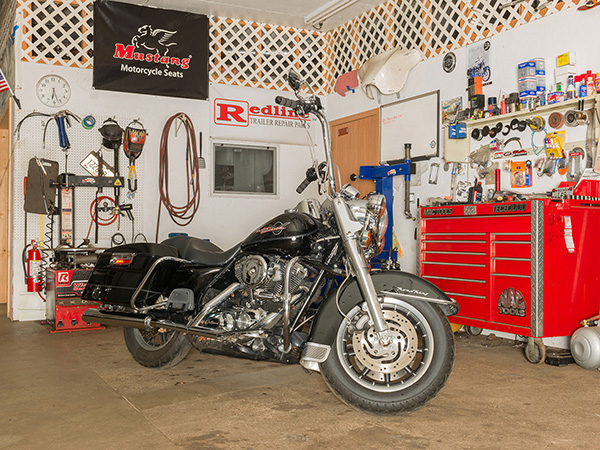 You got it. This is before!
“The process of painting with light is neither simple nor intuitive,” says Hartman. “The high skill level required ensures the look will remain unique and will not be bastardized or diluted by a set of actions or plug-ins. The photographer willing to invest the time and effort required to become proficient in light painting can develop and retain 100% of that lucrative business in their market area.”
 Violin & case Light Painting
 The violin looks just a wee bit different in the before image
John is currently experimenting with an unmanned aircraft vehicle (a drone) using a mounted LED to light paint larger subjects such as buildings, landscapes and large vehicles such as farm implements and fire trucks.
You can see a short video showing him light painting a 1957 Lincoln Continental Mark II here.
Photographers have taken notice of John’s work, and requests to learn his process have resulted in a four-city tour titled The John Hartman Light Painting Workshop, to be held in his hometown of Stevens Point, WI, as well as in Pittsburgh, Seattle, and Sedona, AZ (hosted by Bob Coates). Click here for more information.
Yours in Creative Photography, Bob
Save
Save

by successfulbob | black & white, HDR photography, infrared photography, landscape photography, Lumix G6, Lumix Lounge, photography creativity
Infrared Photography Panorama Style
“The sailing clouds went by, like ships upon the sea.” — Henry Wadsworth Longfellow
Clouds scudding across the azure skies. Words can take you to some beautiful places but as the Chinese say, a picture is worth a thousand words. That’s why I keep an eye peeled on the sky. When the clouds start racing, or even lumbering through the red-rock country of Sedona I grab a camera because interest is added to the scene.
Even if it’s mid-day, I grab a camera and head outdoors. My camera of choice for these times is infrared. I enjoy the high contrast black and white rendering of clouds rendered against a deep dark sky. A Lumix G6 was converted by LifePixel and it has expanded my shooting times as infrared shines when it’s time to put the camera up for regular color photography. I used the Kit lens that came with the camera and was pleasantly surprised at the solid quality of the captures. (G Vario 14-42mm f3.5-5.6) It makes for a super light-weight combo.
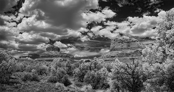 Bell Rock Vista in Sedona – Infrared Panoramic image with Courthouse Butte
I tend to try to push the envelope and experiment when I’m on self-assignment. In yesterday’s adventure, it was to add panorama to infrared. It took quite a bit more work. I’ll let you be the judge to see if it was worth it.
Five images overlapping by about 40% were captured. With the camera set to black & white, three exposures one stop apart were saved in jpeg format to ensure detail in highlight and shadow areas once they were processed. Each set of three images were treated in Aurora HDR software.
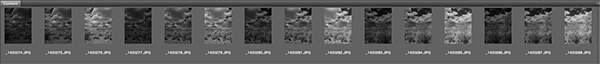 Screenshot of images used before processing
Each of the final five images was loaded into Adobe Photoshop to process the panorama. Whoops! That was an unusual fail. Could be the handheld capture caused some extra deformity in the files. Usually, I can depend on Photoshop to render a solid panorama but with this set of images, there was way too much distortion in the resulting output. (I’ll experiment with these files again when I have some more time and see if different rendering intent might be of help) I couldn’t find my AutoPano Pro software on this computer so I resorted to having Photoshop load all the files into Layers and added my own Masks blending the images together by hand. It’s good to remember the ‘Old School’ methods when the automatic software options aren’t there for you.
Yours in Creative Photography, Bob
PS – Another cloud description I enjoy. “Clouds hastening like messengers through heaven.” —John Hall Wheelock
PPS – Cloud quotes referenced in this post were found in The Free Dictionary by Farlex. I’m book-marking that page for future reference!
Save