Java Presse – Coffee Shoot
The Genesis of a Commercial Shoot
Not quite ‘nectar of the gods’ but I’ve found some serious joy in my morning coffee. It was a gradual process to see the pleasure I now have in the morning ritual and enjoyment of grinding beans, brewing and enjoying coffee.
 Java Presse Coffee image square format final crop
It started with some friends showing the benefits of grinding beans for French Press coffee. Good stuff.
I found myself getting frustrated with the ‘static cling’ that was generated by using an electric grinder that had a plastic bin for catching the grounds and left little trails of tiny grounds scattered along the counter. This led to looking for a mill that had a stainless steel basket. Research showed that prices were more than I wanted to pay. Which turned out to be a good thing! Because that led me to the stainless steel coffee grinder from Java Presse.
The grinder led me to lots more information about the whole process of roasting coffee, the freshness of the beans and proper preparation for the French Press that I use. Thanks to Java Presse the entire experience has turned my morning coffee into an enjoyable ritual. And who knew that freshly roasted beans, ground fresh just before brewing could make such a difference.
I’m a coffee convert.
Photography Process
And, now on the photography section of the making of a commercial image of the product. You can see the final photo at the top of the post above. Below is how the photo was built.
Good, solid commercial images should look effortless and clean. It takes a bit more to achieve the look. I make this happen by creating several images with different lighting patterns which are later combined in Adobe Photoshop. This comes in handy for items that have different levels of reflectance such as the stainless steel of the grinder and coffee storage container as well as making sure logos are readable.
 Note the harsh light patterns in the metal especially the one crossing through the logo on the grinder
 Using a reflector I reshot the scene to give more pleasing light on the stainless steel, but now the reflections that give the image life are gone
 See the difference between the two blended images. Logos are a much easier read, and there are highlights right where they are needed without distraction
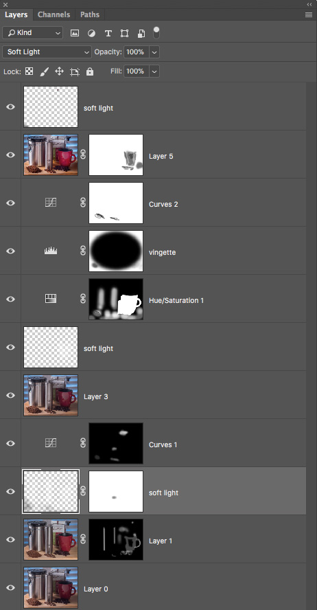 Photoshop Layers Palette is showing some of the work with Masks used to help create the final image.
I also used Skylum software (formerly MacPhun) software called Focus CK. CK stands for Creative Kit. It is a very handy sharpening and blurring tool for directing attention where you want. I often use the ‘Macro’ setting on its layer and mask in what I need.
Yours in Creative Photography, Bob
PS – Here’s the gear I used in this shoot.
2 Fiilex LED lights with softboxes
Lumix G9
LUMIX G X VARIO LENS, 35-100MM, F2.8 ASPH
White foam core panel
Posing table
Tripod Necessary for keeping images in registration for compositing the lighting
Ball head for tripod – Siri Model K-20X

