
by successfulbob | fine art photography, fine art portrait, people photography, photography creativity, tuesday painterly photo art
Tuesday Painterly Art – Kristi Elias
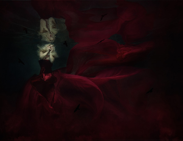
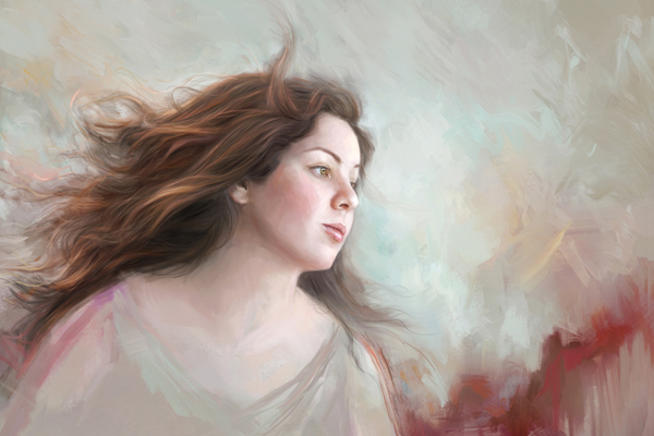
I have watched Kristi grow and set her work apart from others on so many levels. It has been an amazing journey to watch. Here is some of Kristi’s work and words to inspire you in your artistic quest in photography. While Kristi’s images do not involve painting per se they have a distinctive art feel to them. I turn this post over to Kristi.
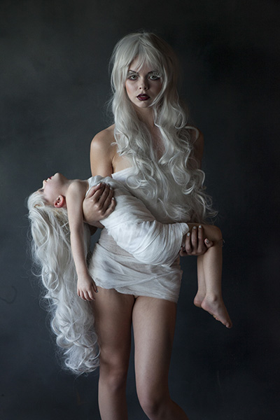
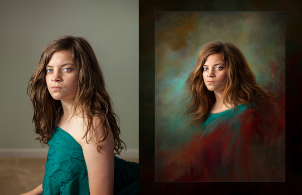
 Look carefully at this image and check out the background build.
(not to mention the build and definition on the fighter) – image © Kristi Sutton Elias Original capture. Note the kicker lights that help with background separation and extraction.
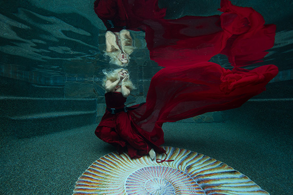
image © Kristi Sutton Elias
“I am a fine art portrait photographer, a good portion of my work is conceptual composites. I create between 40-over 60 composites a week for client orders, some are more involved than others. The amount of time to create the composite varies depending on if I am reinventing the wheel and creating a new concept and artwork from scratch or re-creating a piece that I have created for another client before.
 After processing. image © Kristi Sutton Elias
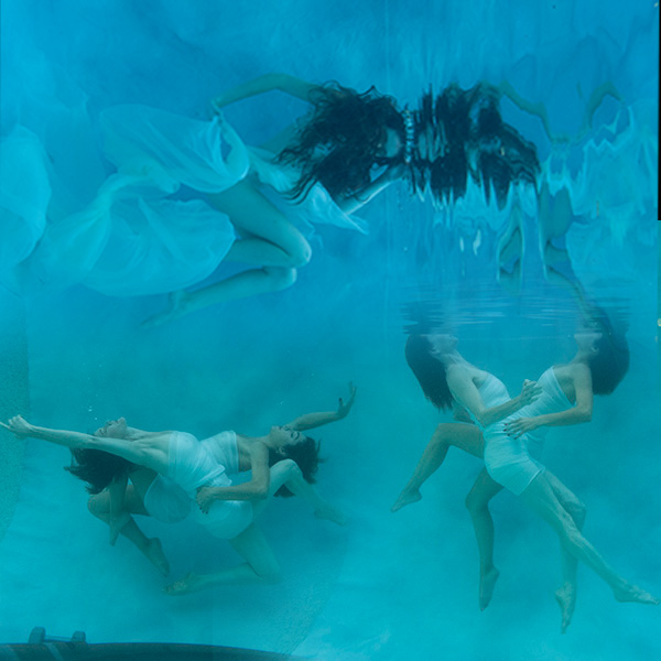
 Original capture. image © Kristi Sutton Elias
“Most of my backgrounds were taken during our vacations, I pick vacation spots based on images I would like to create. Medieval and abandoned castles are my favorite, this year we are going back to Europe and I already have a shot list of where I want to go.
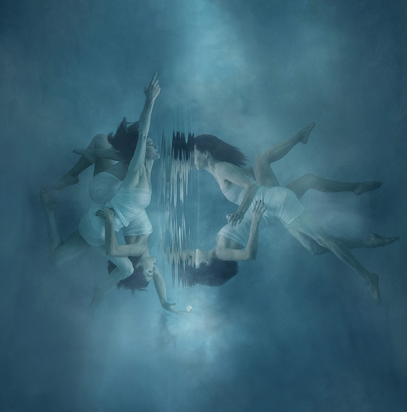
 Original captures. See the final below. (I merged the three images original for this illustration: ED.)
image © Kristi Sutton Elias
 Final image © Kristi Sutton Elias
“After I shoot a session, I upload my images into lightroom and cull through them rating my favorites. After that, I will open my selected image into photoshop and create the composite. Sometimes my composites could be 5 images put together to create the final image and sometimes just 2 images. After I have created my final composite, I use NIK Software Color EFX Pro 4 to create my final vision. I have a few go-to tools that I like to use, but overall each image is treated differently as its own piece of art. Some of my go-to’s are dark contrast and bleach bypass and darken lighten center. The best thing to do is go through all the filters and see what each one does and play with all the levels. Before I start an edit I look at the image and decide what color pallets, hues, and mood I want the final image to portray. I have created hand-painted backgrounds that I photographed and use for textures in my work.
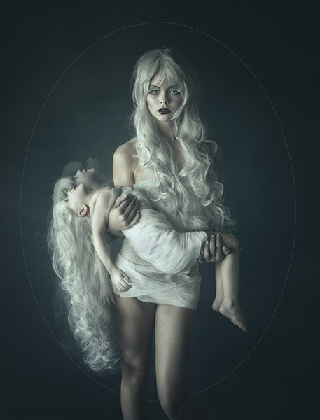 image © Kristi Sutton Elias
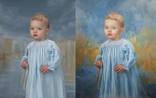
 Starting with a well-lit capture that has depth and dimension makes selling the final image that much easier image © Kristi Sutton Elias
“Another important part involved in my editing, I listen to Love songs or country love songs on pandora while I edit. Mood music :).”
www.KristiElias.com (Masterpiece Portraits)
www.KristiSuttonElias.com (Editorial and Advertising)
Kristi will be teaching a week long class on “The Fine Art of Portraiture” at Texas school this year. Click on the link to learn more about the class. It will be a very creative and fun class!
https://www.texasschool.org/speaker-lineup/kristie-elias/
Yours in Creative Photography, Bob
Save
Save

by successfulbob | fine art photography, fine art portrait, people photography, photography, tuesday painterly photo art
Tuesday Painterly Photo Art
Sandy Harrison
The Artist
“As a child, I was always intrigued with the old black and white photos my dad shared with me about his experience in WWII and how each image told a story of a time before me. My dad gave me my first SLR camera when I was in middle school. My love of photography took off! I was hooked and drawn to capturing landscapes, flowers, and bug pictures. Together, we used the darkroom equipment in our basement. I was in awe as I watched images appear on the glossy white paper right in front of my eyes.
 Painted Image – © Sandy Harrison
 Before Image
I landed a job at the local 6 Hour Film Lab. Instead of sending the small cassette of film off to be developed, I was able to develop and print in the small re-purposed gas station. I spent mornings in the dark cracking open cassettes and hanging the film on big reel hangers which mechanically dipped the hangers into the developing bins and through the big dryers. Afternoons were spent viewing the film. Once the film was printed, I gathered the big reel of paper and started it on its way through the paper developer machine.
Didn’t know then, but later was amazed that my Lab experience helped me in my photography business
with such things as color, density, and over and under-exposed negatives.
 Painted Image – © Sandy Harrison
 Before Image – © Sandy Harrison
I loved to work for the owner’s of the lab at their Camera Store/Portrait Studio. I would spend hours watching the owner take portrait sessions. She encouraged me to learn.
I’ve studied under some amazing talented masters but a few who really touched my heart throughout the years are Van Moore, John and Mary Beavers, Colbert Howell and Rick Alexander. Without the teaching and giving of themselves, I would not be who I am today.
I have welcomed the digital era diving full force in 2000 converting to one hundred percent digital medium from film and have never looked back. I love the flexibility of the digital darkroom aka the computer! I continue to learn and move upward with the flow as the digital medium is in constant change.
 Painted Image – © Sandy Harrison
 Before Image
With the switch to the digital era, came a glimpse of something new again. I sat in a class taught by Marilyn Sholin teaching Correl Painter. It was the vibrant colors and uniqueness of her portrait art that caught my eye. I told myself that day; I needed to learn more about this amazing technique. She was offering workshops just two hours from Charlotte. I enrolled in one of her workshops and again was hooked! The creativity I hoped to accomplish with painter was that of what I see on the walls in museums! I have continued to grow as a photographic artist the past six years or so with the help of Marilyn and her workshops and private tutoring.
 Painted Image – © sandy harrison
 Before Image
Myself, being a photographer, I was inclined to stay in the lines and make a photographic print. She has taught me to be loose, messy and think outside the lines. She encourages her students not to copy but to create a style of their own. In doing so, Marilyn directed me to another Master Artist, Heather Michelle. Heather’s style of painting is more of a traditional approach as well as teaching color theory. Just what I needed as a classically trained portrait photographer. After studying under both of these Master Artists, I’ve tried to take both styles and techniques
and make something of my own. Every painting I do is a work of art from my heart.
I would encourage you to always continue your education. Embrace the new! Accept the challenge of change and make it your own.
Take your craft and your experience and be open to share it with one another. Looking back on my successful career of over 30 years, I am so thankful to those that shared their knowledge with me.
One Moment, One Click of a Shutter and Time Stands Still Forever…
Happy brush strokes!”
To see more of Sandy’s work. www.PhotographicElegance.net
Biography
Sandy Harrison was born in Port Huron, Michigan. She started her career in photography at the age of 20, just newly married. She continued living in Michigan while starting a family and pursuing her passion for photography until moving to Charlotte, North Carolina in 1988 where it
would be a reality and full-time employment in a portrait studio. There she learned the art of classical lighting and posing from Master photographers at the local and state conventions
and workshops.
Sandy embraced her craft and was hired to photograph well-known dignitaries such as Michael Gorbachev. She was hired to photograph basketball star, Larry Johnson’s wedding along with many of the Charlotte Hornet basketball families in the 1990’s. She was also the first to be featured on the Carolina Bride Magazines cover adorning Lisa Cooley, Charlotte’s premiere news person. Sandy’s keen eye and ability to capture the true essence her subject makes her a sought after photographic artist. Her work continues and hangs in many homes in Charlotte and the surrounding area.
Sandy pioneered the digital era in the Charlotte area being one of the first to make the transition to
the new digital media. In doing so, she surpassed many of her associates and got a head start
in the digital world in 1999 and has never looked back.
Keeping true to her passion and drive wanting to learn new things, Sandy started painting portraits in
2009. She continually studies under several Master Painters and is always expanding her knowledge in
yet another medium.
Yours in Creative Photography, Bob
Save
Save
Save
Save
Save
by successfulbob | fine art musician portrait, graphic design, Lumix GH4, Lumix GX8, Lumix Lounge, musician photography, people photography, photographer of musicians
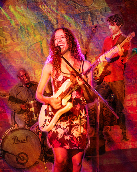
Jackie Venson at Sound Bites Grill
Sound Bites Grill has a new addition to the ‘Wall of Fame.’
Jackie Venson and her band were enshrined at the SBG Wall last night.
 Here are Jackie Venson and her band in art form.
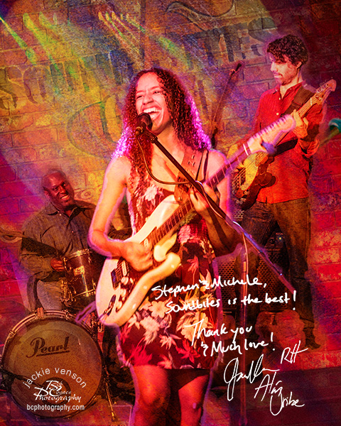 Here’s how it looks on the Wall. The autographs are done in advance on a white piece of paper with black Sharpie pen. I’ll show you all the elements used to create the final image below.
The ‘Wall of Fame’ image is created with photos captured during the live stage performance in the Sound Bites Show Lounge. Each performer is tracked on stage individually. Then they are extracted from the background and placed into a new environment. Texture, shadows, glows along with sharpening, blurring parts of the combined images are all combined in Adobe Photoshop to create the final art piece. Capturing the musicians during the live performance gives the final art image a stronger feeling of emotion created during the performance that a static image just doesn’t have.
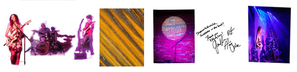 Here are the elements for the final image. Layers and Masks along with Blend Modes were utilized in creating the painterly look.
Images are currently being captured with the Lumix GH4 or Lumix GX8 cameras. I enjoy that the sensors have enough density range to allow a single capture of the harsh LED lighted scene. A slight adjustment in post production using Adobe Camera Raw (ACR) of bringing down the highlights and opening up the shadows makes for a well-exposed photo. In previous cameras due to the extreme light variations, there was a need to capture three images and blend them together to achieve the same result.
Yours in Creative Photography, Bob
PS – Can’t wait until Jackie, Alán Uribe on bass/backvox and Rodney Hyder on drums come back for their next show at Sound Bites Grill
by successfulbob | fine art photography, fine art portrait, people photography, tuesday painterly photo art
Tuesday Painterly Photo Art
Heather Michelle Chinn – AKA “Heather the Painter” Corel Painter Master Elite, Corel Certified Painter Educator, Golden Artist Educator, M.Photog, M.Artist, CR.
Completely captivated!
Came across the first image in this post when I was judging an imaging competition for Professional Photographers of America (PPA). It was obviously in the Artist category, but it was such a fantastic portrait that contained an incredible personality. I loved it! Great skill was needed to make this fantasy piece believable.
I have since been exposed to more of Heather’s work, and she shows why there are so many credentials following her name. Another image, in an entirely different style, cemented the fact I wanted Heather to be featured in this blog about Painterly Photo Art. I won’t tell you which image, but know that “Leo” is one of my all-time heroes in the art world. Here’s Heather.
Learning Corel Painter
Creatives wanting to learn Corel Painter, and traditional oil/acrylic painting often ask what they can study to learn how to produce stronger paintings. Studying traditional artwork in a style that moves you is the key! Look at the same elements used to judge the International Print Competition** and you can see how it translates into a more PAINTING-focused list:
Here we go!
Impact – Does this grab the viewer/collector for a long time and stir emotions by using the following elements?
Technical Excellence – Are your brush strokes varied to a degree where not everything looks like mush, or “matchy-matchy?” How are your shadow/highlight transitions accomplished in blending or laying varying levels of colors next to each other? Is the texture interesting and supportive? Are the brush SIZES supporting and appropriate? Are objects correctly proportionate?
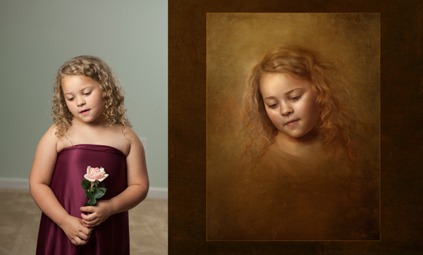
 “Letters to Penelope” © Heather Chinn Photography
Creativity – Is this something “new” that viewers/collectors haven’t experienced before? Is it a different take on a theme?
Style – Does your heart and soul show through your art? Is it an accurate expression of the real you? People can tell. If it’s you, it shows.
 “Defiant” before/after © Heather Chinn Photography
Composition – Does the layout of choices such as value range, lines, subject shape weights, etc. support your story? Does it keep the interest of the viewer without them knowing why?
Presentation – Is it presented in a way that best supports the painting? IE: Frame choice? Hanging height with lighting choice? I rarely use thin frames, and try to find frames that are at least 4″ in width or matches the subject’s face size. Is it best presented on paper or canvas? Watercolors, pastels, charcoals, and more modern interpretations read beautifully on papers. I’ve found traditional paintings are best received on canvas. It’s up to your style and taste. Is it hung at eye level? Is it well lit?
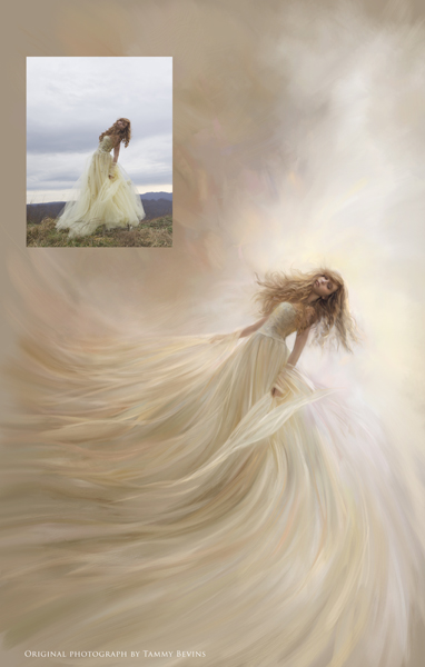 “Elysium” © Heather Chinn Photography Original photograph Tammy Bevins
Color Balance – I believe this is crucial to a painting being successful. If you look at well-known pieces by the Masters such as Monet’s waterlilies, John Singer Sargent’s portraits, or the brilliant works by Vermeer, you’ll see not every color in the spectrum was used. That can be overkill unless it aligns with your style (more modern). The aspect of BALANCE is of paramount importance. Are the colors overall easy to view for a long period, or does the saturation scream at you? Does the harmony and balance of colors playing together work to support the message? If you look at a Sargent portrait and take it into Photoshop and look at the colors used, you’ll find very few super saturated colors are used. Saturated colors were reserved for pops of “surprise.” Limit your “aha!” color moments for a more pleasing, easy-to-look-at-for-a-long-while masterpiece.
This links to an excellent post on color theory: http://www.oil-painting-techniques.com/color-theory.html
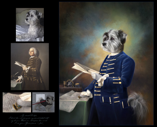
 “Culvarious” before/after marketing piece – © Heather Chinn Photography
Center of Interest – This absolutely has to support your story. What are you trying to say to the viewer? Is it about the portrait of the face, or maybe a secret message about the surrounding props? Leading lines, lighting choices, highlight placement/shadow placement can all subconsciously lead the viewer here. Brushwork can also lead to the center of interest by refining your strokes and intensity of detail into the area you want the viewer to “land” and stay awhile.
Lighting – This absolutely must support your story, again (seeing a pattern here?). Dramatic lighting on a fresh newborn baby speaks of ominous tones or dramatic backstory. If you study the popular Old Masters paintings, you may notice two things: direction lighting (versus flat lighting), and an element of backlighting make for STUNNING paintings. Flat lighting is harder to paint, in my opinion. There is no clear definition of highlight placement. It works for some artists. For me, I tend to love clear, defined highlights that come with direction lighting, and a backlit/hair lit portrait. Is the lighting the most flattering to your subject?
 “Divinely DaVinci” – © Heather Chinn Photography (This image ROCKS! ED.)
Subject Matter & Story Telling – These are pretty self-explanatory! What the heck are you trying to convey in your artwork? Is it clear?
Technique – Balance your colors. Balance your brush texture. Varying degrees of blending/hard edges will make for a very interesting painting. There must be some tension of contrast between your elements.
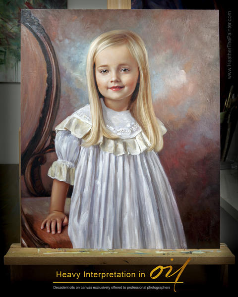 “Oil Interpretation Marketing Piece – © Heather Chinn Photography
Heather’s Extra Tips
I would recommend getting lost in art museums, gallery showings, Pinterest, Behance, and playing with paint! Take screenshots of images that move you. Put them in a single folder, and then go through this list trying to find similar elements between your favorite artwork? Do you find you’re drawn to more monochromatic paintings? More bold colors? Flat lit? Directionally lit? Strong lines, or soft, blended, peaceful scenes? Is there similar brushwork? Is there a dominant color family consistently used? Is there a consistent subject matter?
Maybe if you can find similarities, you can apply those to your masterpieces! Even if you don’t paint in your studio, when applied, these elements will grow your portraiture.
 Heather’s Headshot – © Heather Chinn Photography
Happy painting, Heather
———————-
Heather Michelle Chinn was born with a paintbrush. From early on she would paint anything with any medium within reach from food to nail polish. Her earlier masterpieces were painted inside closet walls and eventually translated into professional murals in Fredericksburg, Virginia. For several years, Heather painted whimsical watercolors for the international stationary company Mon Petite Chou.
Heather is an experienced presenter in live and recorded demonstrations. She has been teaching Corel Painter and mixed media at multi-day workshops, live seminars and webinars, and PPA affiliate schools all across the country for the last eight years. Known for what is consistently called her “calming” manner of speaking, being graceful under pressure, concise and thorough, with easy-to-follow Corel Painter tutorials. Heather is a natural educator across multiple platforms.
Two of her ethereal paintings of children, “Little Miss” and “Not A Girl, Not Yet a Woman,” were featured among 135 artist’s work out of thousands of entries in Ballistic Publishing’s first Painter book. Heather’s masterpieces are consistently featured in the prestigious, annual PPA Loan Collections where only a small percentage of the world’s best photographic artwork is selected among thousands of entries. Interviews and artwork have been featured in multiple Showcase Collections, French Photography Magazine, Digital Photo Pro UK, After Capture and the Official Corel Painter Magazine. Recently, Heather’s work and collaborative efforts have been published in Painter Showcase, a collection of several worldwide digital artists’ masterpieces available at Amazon.com. Her belief that anyone can easily use Corel Painter to create their own keepsakes led her to a speaking platform at the beautiful Phoenix Symphony Hall for the Professional Photographers of America’s International Convention in Phoenix, Arizona in January 2014. Heather made her television debut on Lifetime Television’s “The Balancing Act” in April of 2014.
When Heather isn’t creating oils and mixed media paintings for her photographer clients, or retail collectors on the easel, she travels the country inspiring and mentoring the budding or professional creatives in mixed media and figurative expression. Her time is devoted and divided between painted commissions, and education. It is said that Heather’s “soul” is often very clearly seen in her work. Her elegant brushwork and transcendent color harmonies capture the ethereal essence of the subject and evoke an emotional dialogue between viewer and painting.
To learn Corel Painter, please visit Corel’s vast library of free tutorials at www.Youtube.com/PainterTutorials
Please subscribe to my Youtube channel at www.Youtube.com/HeatherThePainter
Be sure to subscribe to the newsletter at www.HeatherThePainterStore.com for updates on webinars and workshops! There are in-depth tutorials of step by step training on www.HeatherThePainterStore.com. Heather is available for digital painting and acrylic/oil embellishing private and group workshops, private online training, and speaking.
The top two tutorials that help people who have never used Corel Painter, or have never PAINTED before are the “Intro to Painter” and “Portrait Box Set” available for immediate digital download at www.HeatherThePainterStore.com
Deals for Successful-Photographer readers from Heather until September 1st, 2016
“save25” saves $25 off the new Classical Remixed Backgrounds Collection (even if it’s on sale)
“successful” saves you 20% off any tutorial training (even if it’s on sale)
www.HeatherThePainterStore.com and www.HeatherThePainter.com
Yours in Creative Photography, Bob
** PS – Heather’s post comes at a great time and talks about the twelve elements as used in International Photographic Competition (IPC) Judging starts this Sunday and you can watch the process live. Fabulous education even if you haven’t entered images this time around.
International Photographic Competition
Welcome to IPC Live, streaming July 31 – August 4, 2016. Everyone is welcome to watch! If you are a PPA member, login with your username and password. If you are not a member, create an account below, and enjoy the show! Here are the showtimes:
IPC Judging Live Stream: Sunday, July 31, 4:30 pm – 6:30 pm EST; Monday, August 1 – Thursday, August 4, 8:00 am -6:00 pm EST
IPC Live hosted by Booray Perry, Cr.Photog., CPP: Monday, August 1-Thursday, August 4, 10:15 am & 2:15 pm EST
Save
Save
Save
Save
Save

by successfulbob | Lumix GX8, Lumix Lounge, musician photography, photographer of musicians, photography, photography - art quote, photography creativity, photography education
Sunday Photo/Art Quote – Yogi Berra
A major league baseball manager, Yogi Berra, was a font of excellent one-liners that more than stated the obvious.
The one I wish to share with you today can easily be applied to the arts. Yes, while it’s obvious, sometimes we need reminders of just that. And Yogi was a pro at that!
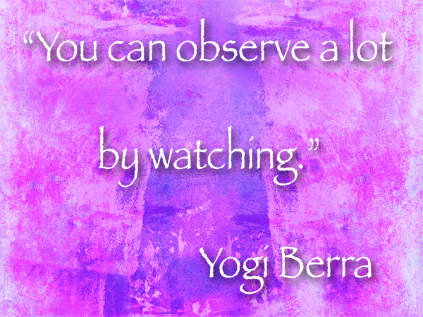 “You can observe a lot by watching.” Yogi Berra
The reason I bring this up today is the quote jumped out at me after returning from a guitar concert under the stars last night by Anthony Mazella at The Collective in Sedona. Anthony is a world class musician who creates magical times with his guitar.
As always I carry my camera. Lately, I’ve been trying to follow Yogi’s advice although I didn’t realize it was coming from him. I’ve been trying to be more aware of light. Paying attention to it. And trying to capture more of it in challenging situations.
I used the Lumix GX8 with a 35-100mm f2.8 Vario lens. While Anthony filled my head with his music, I kept myself aware of the changing light as the sun dropped below the horizon. The lights in the area began their illuminating dance through the venue. And I recorded.
Here are a few of those captures.
 Shadow, color, composition, shape, and form were the things that caught my eye
 A glance up and this silhouette appeared. I watched for a few moments, and the little girl was moving in and out of the frame I waited until she was moving out to capture this. The play of the complementary colors was a bonus.
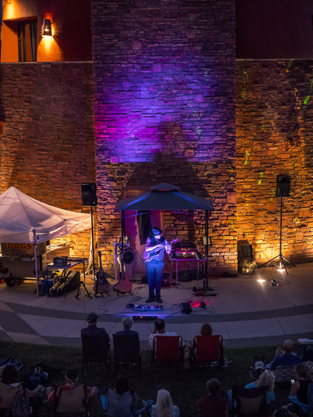 Of course, the star of the show couldn’t be left out. The blue, purple and magenta lights added some serious color to the warm toned brickwork.
Had I not been aware and keeping my eyes peeled for an opportunity to see I might have missed these little vignettes of light and color. So remember Yogi’s advice, “You can observe a lot by watching.”
Yours in creative Photography, Bob
PS – Here are 50 Yogisms gathered in an article by USA Today. It’s a fun read.
Save
Save
Save
Save
Save