by successfulbob | art books, Guest Post, inspiration, photography, photography books
Number four of the five-part series on getting your photo book into print from my photographer friend Sara Frances. Start with Part One.
You are Designer and Editor
Paying outside services for book consultation, editing, cover, and design are the costs that put a book project out of reach to most photographers. Here’s the good news: your abilities with image making and with Adobe apps give you the tools to do this yourself. The power and facilities of Photoshop now provide almost everything you need; Both publishers and Adobe are noting that many books, including my own Fragments of Spirit, are now designed exclusively in Photoshop. Who better to select, sequence and design your photographic art into a beautiful book?
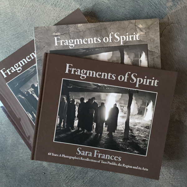
Cover of my own Fragments of Spirit showing both hard bound and soft bound versions. Note they must have separate ISBN numbers.
What do you need to know?
Once you’ve selected your eventual print house, query them about every detail of the specifications, and make a reference copy of all of this: file size and type, resolution, template, bleed margins, gutter, color space conversion, embedding images, vectors, layering, paper type and weight, cover stock, cover materials and debossing, single page or spreads, PDFs, FTPs, proofing, corrections, timing, delivery. You’ll be responsible for all of these, but it’s like paying yourself back for many things you already know how to do.
Three main pitfalls.
• Conversion to the specific CMYK required may make changes in your original file. Open the original and converted files side by side and compare as your monitor simulates that color space.
Go to View>Proof Setup>Custom and then a drop down menu. This is not sticky, so you have to recheck constantly, and it’s tricky to have two files open with different settings.
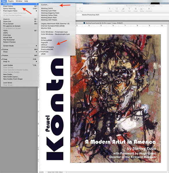
Where to find the Photoshop simulations of different color spaces. Click the Custom menu option for the long list, then save the ones you use most often lower down. Cover of an artist’s retrospective book I am currently designing for a museum.
• Different types of printing will require different contrast, saturation, and sharpness. This is an experience thing, and sometimes quite subtle. But you’re a stickler for precision, aren’t you? Ask (and pay) for a few pages in advance proofing to see directly what you need to do. Continuity is king. Sometimes proofing is with inkjet that will be similar, but not as sharp as the final printing, and possibly have a paper-driven color bias (this is not done on your studio Epson or Canon equipment.)
• Photoshop is a hybrid: not fully bitmap or vector in its file structure. Vector PDF submission is essential for all traditional offset printers I’ve encountered. I’ve found the easiest way to create the vector PDF is to open in Illustrator> convert layers to objects> save out as an Adobe PDF. Then Acrobat will take the single page or spread file and create one document. You’ll be uploading to the printer’s proprietary site.

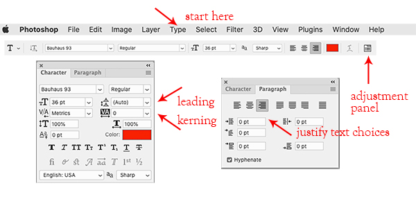
Settings that make you look like a seasoned pro with type manipulation in Photoshop.
Sound like a lot?
Not really, because you are only adding a few nuances to the skills for every piece of commercial work you manipulate and enhance.
Want more detail? Sign up for my Zoom online 8-week class at Osher Lifelong Learning Institute at the University of Denver, Boulder location. All teachers are unpaid volunteers. Next class starting 1/12/21.
Or, look for the next Professional Photographers of America Super One Day!
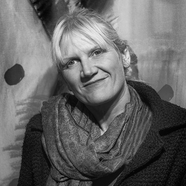
Sara Frances
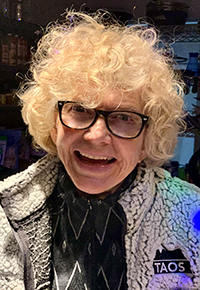 Sara is a many-decades Master Photographic Craftsman out of Denver whose artistic focus has always been book making with images. Her albums won PPA merits starting well before digital capture, as well as for what is believed to be the first ever awarded portrait album. She has evolved from daily, shorter-term studio photography into exclusively special projects of long commitment. Her second hybrid photo/memoir art book, Fragments of Spirit, now published under her own mark, Photo Mirage Books, is available mid-December 2020.
Renewing her lifelong interest in creative writing, she was recently was accepted for Lighthouse Writers Workshop’s Poetry Collective, graduating a year later with a forthcoming hybrid work marrying over 275 manipulated iPhone images with 120 poems: What to Wear to Paradise.
Her three-year quest to learn all facets of the art book industry has influenced her to give back with hands-on publishing classes. She is a judge for the Independent Book Publishers Association (IBPA) and for Colorado Independent Publishers Association (CIPA.) She teaches for Osher Lifelong Learning Institute (OLLI) at the University of Denver, for PPA Super One Day seminars, and also mentors hybrid image/text projects.
To find Sara on social media search SaraFrancesPhotographer or email – imagination@photomirage.com

by successfulbob | graphic design, photography, photography creativity, photography education, photography retouching, photoshop tutorial
Texas School
The Best Little Photography School in the World
I spent last week in Addison Texas attending Texas School. This was my first time at this week-long orgy of photography education. It is intense. You spend a week with a single instructor getting a deep dive into their techniques in creativity. It was a blast.
The class I choose to attend was with Richard Sturdivant. (Check out Richard’s work and his tool shop) Sturdevant brings an artist and graphic design background to create composite images that transcend photography. To say I learned a lot would be an understatement. Richard’s use of tools in Photoshop is an eye-opening experience. New tools. New techniques. New ways of looking at the world to enhance reality into fantasy with a hyper-realistic look.
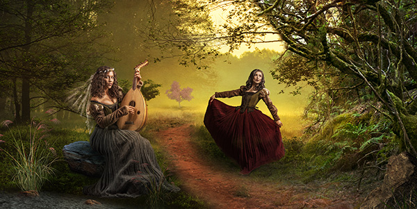
Here is an example of one of the projects which the class worked on.
 My finished piece from the class project.
A photo session was shown using MoLights which can change the way you photograph subjects that have movement. A post will follow specifically about that. In the photo session, the model was asked to perform, and these lights fired as fast as the camera could fire. With my Lumix G9 that means twelve frames per second. NO misses!
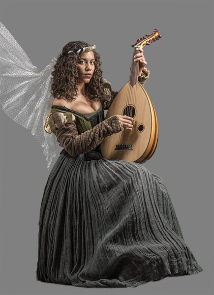
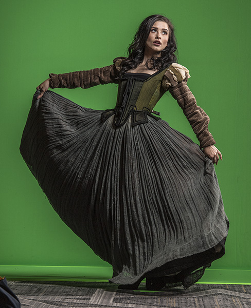
Photos were made of a couple of models in a period dress, and stock files were shared. Each student worked with the images with a base of instruction but each finished piece produced was different. It’s kinda like when you give ten photographers the same subject, and you’ll end up with ten different interpretations.
Below see some of the working pieces from the project. There were tons more, but you get the idea.


 Look at the final image and see how many elements were added from the image directly above.
Yours in Creative Photography, Bob

by successfulbob | fine art photography, graphic design, inspiration, Lumix G9, photography, photography creativity, photography gear
It’s Good To Have A Muse
Having a fellow artist who encourages you to explore new areas and ideas within your specialty is a fabulous tool to supplement your creativity.
Meet Pash.
She is my muse.
 Pash Galbavy – Learn more check out her website
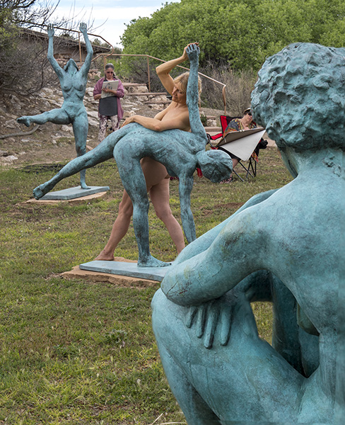
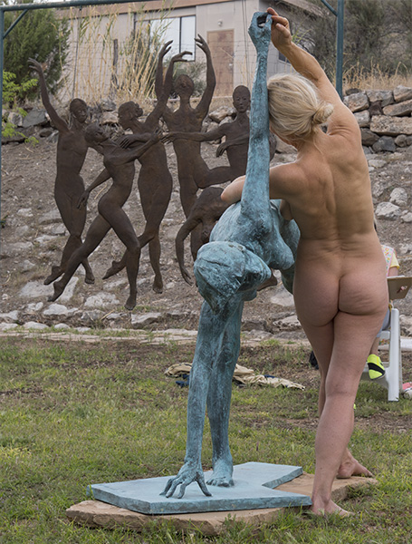
Pash is a life model, dancer, mask maker and performance artist. Her tagline is ‘Masks, Movement, Modeling and More.’ She often is performing new concepts and pushing boundaries that inspire and inform new work for me. Just yesterday Pash asked if I would cover a life posing event for her with her artist group. This day would find Pash and her group at the gallery of John and Ruth Waddell in Cornville, AZ. The Waddells have created a magical space with bronze sculptures dancing and cavorting around the property. A truly magical area that Pash enhanced with her interaction while the artists sketched and drew their interpretations of the scene.
 Pash in a pose integrated with John Waddell’s bronze
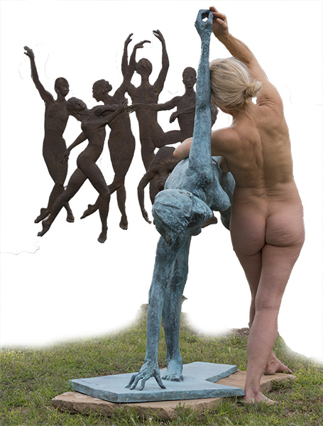
 Pash asking me to photograph and document her event had me make this image
 Which led to me isolating some areas in moving toward a new piece of art
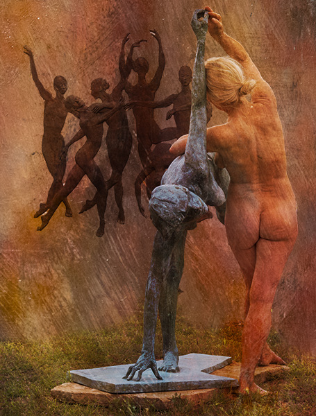
 Working sketch experimenting with beginning textures
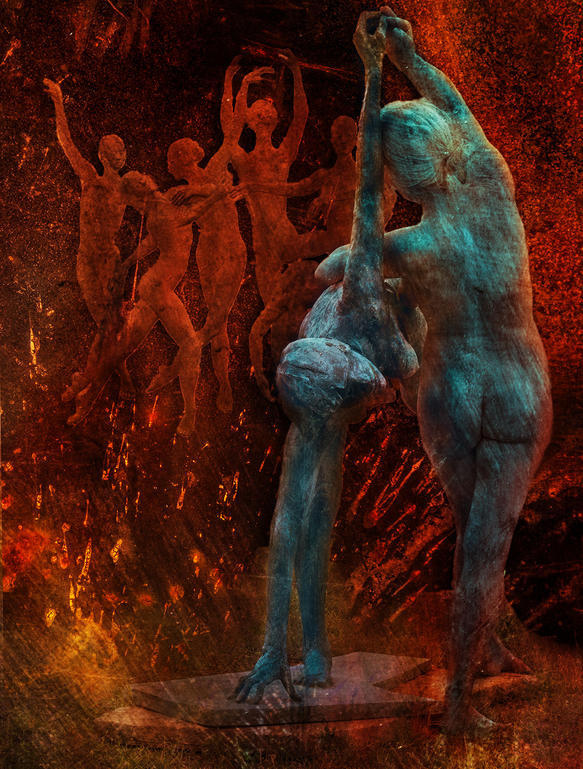
 A picture I am currently calling ‘Merge’ (working title)
Images such as this are put together utilizing multiple photos of textures blended using Adobe Photoshop Layers, Color Modes, Blend Modes, and Masks. I sometimes will experiment with ten to twenty different versions before settling on a final image. This one is getting pretty close.
Images in this post were captured with the Lumix G9 and the Leica 12-60mm f2.8-4 lens.
Yours in Creative Photography, Bob

by successfulbob | fine art musician portrait, Lumix GH4, Lumix GX7, Lumix Lounge, musician photography, people photography, photographer of musicians
Photography of Musicians at Sound Bites Grill
The Black Market Trust
Photographing musicians during a live performance can be a bit of a challenge.
But I dig it!
If you follow this blog you know I am charged with creating the marketing images for bands who play at Sound Bites Grill in Sedona. Also, the ‘Wall of Fame’ is a record of performers who have graced the stage and is becoming a history of entertainment at the restaurant. To date, there are over eighty art pieces presented on the wall.
Here is the latest.
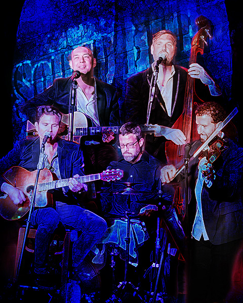
 The Black Market Trust Band
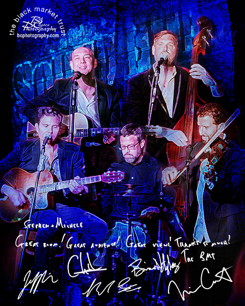
 Here is the finished piece as presented on the ‘Wall of Fame.’
While the band is performing, I isolate each member and extract them from the scene and then blend them back together while creating the art piece for the wall. These were captured with the Lumix GX7 and the 35-100mm f2.8 Vario lens. After each member is placed on the new canvas layers of texture, drop shadows, and lighting effects are added to create depth and dimension.
While the musicians are on site, I gather their ‘message to the house’ and autographs for inclusion in the final art piece. These are signed in black Sharpie on white paper. After scanning, using Adobe Photoshop they are imported to the final image, sized and inverted to white text. The Blend Mode of the Layer is changed to Screen. This makes the inverted paper, which is now black disappear with no further selections necessary.
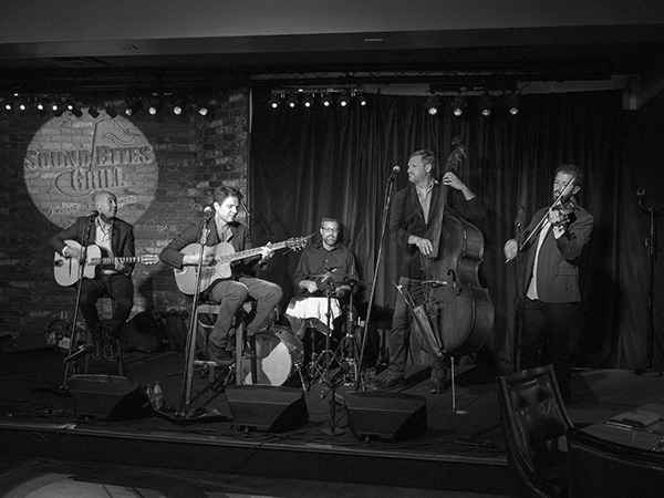
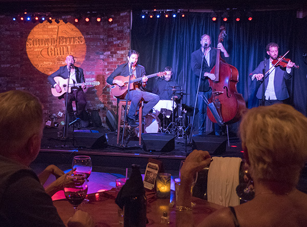
Images for the newspaper are also prepped. I shoot in color but do the prep to black and white for the best printing results. Many times a color image is just changed to greyscale by the paper and using NIK Silver FX Pro 2 makes for better contrast and tones. These were captured with the Lumix GH4 and the 12-35 f2.8 Vario lens.
 Black & White photo The Black Market Trust Band
 Color image of the BMT Band
Yours in Creative Photography, Bob
Save

by successfulbob | art books, fine art photography, inspiration, photography, photography creativity, tuesday painterly photo art
Tuesday Painterly Photo Art
Julieanne Kost – Adobe Photoshop Evangelist – Part One
One of my heroes, Kost, has been an inspiration from the first time I saw her give a presentation on Photoshop.
Knowledgeable, talented, giving, humble, and funny she is. I highly recommend that anytime she is giving a program near you, just go. You will be entertained as you learn tips and tricks in processing images with an incredibly powerful software program.
Let’s turn this over to Ms. Kost and start with her artist statement featuring her personal artistic work. In the future, we’ll revisit Kost featuring other facets of her work.
“In my work, I combine a passion for photography, a mastery of digital imaging techniques and knowledge gained from a degree in psychology, to construct a world similar enough to appear familiar, yet obviously, an interpretation of the physical reality that surrounds us.
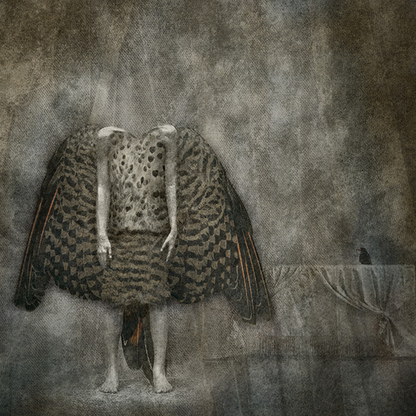
 Image ‘Untitled’ – © Julieanne Kost
Although the images are highly personal representations of my dreams and personal reality, they are abstract enough to allow individual interpretation (based on each individual’s history and life experiences). I hope to engage the viewer with the image to allow them to leave the reality that they hold true and explore, even if only for an instant, and venture into the visual placeholder of my thoughts and dreams.
Over the past 20 years I have created libraries of individual elements ranging from photographs of textures and landscapes, to scans of found objects, to encaustic paintings and charcoal drawings. Although these ingredients are not an end in and of themselves, they are waiting to take their position as a component of a larger message. The common thread is that each individual element must evoke an emotional response. What that response might be (positive or negative, comforting or confrontational) is not important at the creation stage, because how the image will be used at that point is not clear. I draw from these libraries to build images and communicate my message.
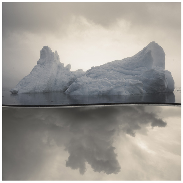
 Image ‘Two Birds’ – © Julieanne Kost
Because the components are created at different times in different locations, I find that my work falls somewhere between the more traditional photographic practice of capturing a single decisive moment and the time compression techniques used to tell a story in cinematography. In my images, I create imaginary scenes layering elements together that are unconstrained by linear time and physical location. By choosing elements that work together to form a cohesive message, I am able to create a composite image more powerful than it’s individual parts.
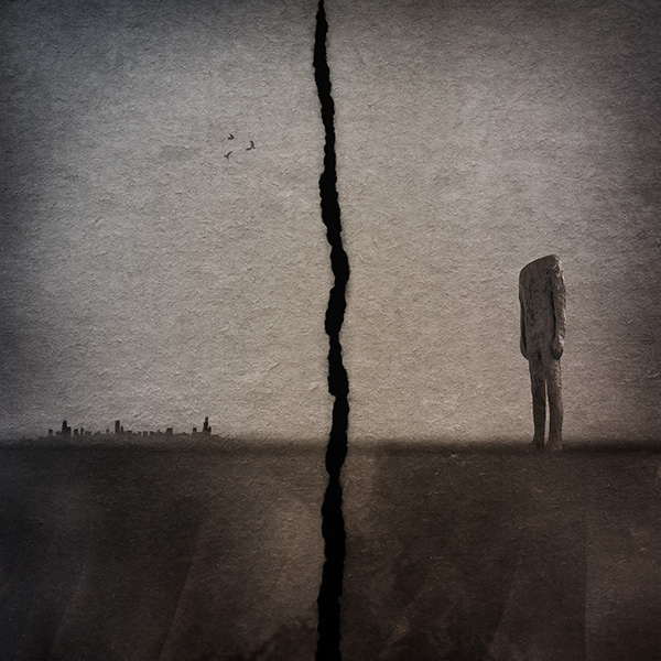
 Image ‘Waiting’ – © Julieanne Kost
The interactive process of selecting and assembling images is one of the most challenging and thought provoking parts of my creative exploration. Although overall, the images may appear serene and calm, the act of creation is anything but passive. I begin with a concept in mind, yet I may not know exactly how the pieces will fit together at the end. As the image takes on its own life, I often allow myself to explore additional directions, sometimes finding that the final image only faintly resembles the one first imagined.
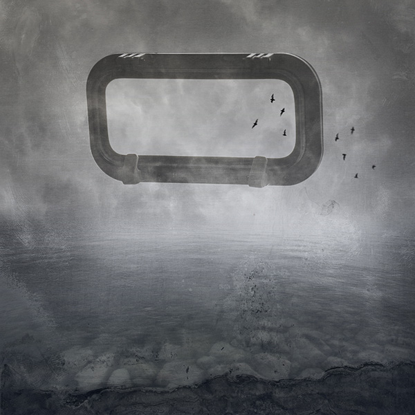
 Image ‘Perception’ – © Julieanne Kost
From a technical standpoint, I feel that a computer is not merely a shortcut for what is possible with a camera, but instead it allows me to discover what is possible in no other medium. However, with the digital realm being so forgiving and offering so many options for exploration, that discipline becomes part of the challenge. The paint is never dry, the exposure is never fixed, and the print is never final -all components can be done differently at any point. Here the art form is knowing when to stop and realizing when you’ve said what you set out to say.”
If you would like to learn more about compositing from Julieanne she has video classes available.
https://www.lynda.com/Photoshop-tutorials/Introduction-Photo-Compositing/191608-2.html
https://www.lynda.com/Photoshop-tutorials/Art-Photoshop-Compositing/147534-2.html
Yours in Creative Photography, Bob
Kost’s bio below.
Named one of Fast Company’s “100 Most Creative People in Business,” Julieanne Kost is a Principal Evangelist at Adobe Systems, responsible for fostering relationships with customers through meaningful and inspirational Photoshop and Lightroom instruction. As a highly sought-after speaker for the industry-standard Digital Imaging franchise, she devises and presents motivating and educational training sessions, sharing original techniques and tutorials worldwide — via live events, Adobe.com, her own website (jkost.com) and blog (blogs.adobe.com/jkost). She is also the author of “Passenger Seat—Creating a photographic project from conception through execution in Adobe Photoshop Lightroom” and “Window Seat — The Art of Digital Photography and Creative Thinking”, (I have an autographed copy: Ed) an accomplished photographer and fine artist, and creator and host of the popular Photoshop CC Essential Training, Adobe Camera Raw Essential Training, and the Art of Photoshop Compositing for Lynda.com.
Kost is well-known for her unique approach to instruction, infusing practical tips and tricks with an equal amount of humor and creativity that keeps audiences entertained and engaged. She often serves as a guest lecturer at distinguished photography workshops, industry events, and leading educational institutions around the world. She’s a contributing columnist and author for a variety of print and online publications and has created over 500 instructional videos as the host of Adobe’s “The Complete Picture” featuring Lightroom and Photoshop, serves as producer and instructor of the “Lightroom Getting Started” and “What’s New in Lightroom,” training courses, as well as the “Revitalize your Workflow with Lightroom” seminar on CreativeLive.
Kost has been recognized for her outstanding service and contributions to the professional photographic industry, winning the Gerhard Bakker Award from the Professional Photographers of America, the Honorary Educational Associate Award from the American Society of Photographers and was inducted to the Photoshop Hall of Fame by the National Association of Photoshop Professionals.
The combination of her passion for photography, mastery of digital imaging techniques and her degree in psychology, makes her photographic and fine artwork familiar, yet surreal with inventive and mysterious worlds where things are not quite as they seem. Her work has been exhibited numerous times and featured on Behance.net, PetaPixel.com, thisiscolossal.com, photographyserved.com, and Photoshop.com.
Kost holds an AA in Fine Art Photography and a BS in Psychology.
Save
Save
Save
Save
Save


 Sara is a many-decades Master Photographic Craftsman out of Denver whose artistic focus has always been book making with images. Her albums won PPA merits starting well before digital capture, as well as for what is believed to be the first ever awarded portrait album. She has evolved from daily, shorter-term studio photography into exclusively special projects of long commitment. Her second hybrid photo/memoir art book, Fragments of Spirit, now published under her own mark, Photo Mirage Books, is available mid-December 2020.
