The Painter’s Keys. An excellent twice weekly newsletter was started by Canadian artist Robert Genn. Robert is no longer with us, but the bi-weekly letter and website were carried on by his daughter Sara who is a talented artist and writer in her own right.
Robert was not only a talented acrylic on canvas artist recognized throughout the world for his work depicting the west coast of Canada, but he was also a thinker on the process of creating art. That’s why I grabbed a quote from him for use this morning.
“It’s the child that makes the artist.” – Robert Genn
In my opinion, this quote is a very simple but important one. There is a tendency to loose our inner child as we grow up and into our careers. When we first try our hand at art as a child, we work with abandon and no thought of what is ‘right of wrong’ we just do. As we age, we begin to listen and be shaped by the outside world of parents and teachers and supposed friends who tell us what is wrong with our work. How we can’t make a living as artists. How we could do something better if we just did it the approved way.
To grow as artists, I suggest that we go back to that inner child now and then and just play with wild abandon. Try something new. Push boundaries. Don’t label something as good or bad but as a learning experience. I talk about this many times, but it’s a message that will help you forge new art in your life. Don’t be afraid to make mistakes. Don’t listen to people that tell your work is not up to par it doesn’t matter. Play. Play some more. Study new ideas and try to put them into practice.
From Sara Genn’s Latest Letter/Post – “Your Brain on Art’
Scientists ‘read dreams’ using brain scans. Rebecca Morelle, BBC science
Will this result in masterpieces immediately? Many times no. But often it can lead you down a new path to help you become a more creative individual. Picasso had a quote along similar lines, “Every child is an artist. The problem is how to remain an artist once we grow up.” – Pablo Picasso
Don’t let the world take out your inner child.
Yours in Creative Photography, Bob
PS – You can click on either link in this post to check out and subscribe to the Painter’s Keys
“Bob, your images show your expertise and I absolutely agree with all you say. I will add one thought. The images you show in your article are for the Artist category. My thought is those entering for the first time might mostly be in the Photographic category. So maybe you can add some of your beginning ones that merited rather than your most recent advanced ones for perspective.
Some of my own frustration does lie in that critiques in the Photographic category often talk about changing backgrounds, etc. To me that should be in the Artistic competition since that is not “photographic”, but I understand there is not a way to monitor this, so anything goes in Photographic pretty much.
I think it is important to explain to entrants that even if your image scores a 74 let’s say, this is based on a professional standard and is “average among your peers” so it is not “average for anyone with a camera.” So there should not be fear to enter because you might not be good enough. My thought is this, if I thought I was not good enough, I certainly would want to know that and learn. I would not be charging clients money for my work if even I thought I was not good enough. On another note even a score below competition standard of 65 might be a sellable client image in some instances, it just misses too many marks of the 12 elements for merit.”
——————————
Joanne Fabian
Photographer/Owner
J Gray Fabian Photography
Souderton PA
Excellent thoughts from Joanne. I will pass on the idea about critiques and backgrounds to other PPA Jurors in the Photographic Open category. We are always trying to improve the experience of judging and providing feedback to members. (I am a PPA Approved Juror)
The images that I shared in the original post were ones that I had quick access to and wanted to illustrate the post. I took some time to dig back in through some older files for examples in the Photographic Open category that merited and some that made it to the Loan Collection and below a video of many of my entries over the years.
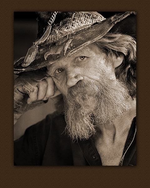
‘Randy’ – General Merit & Showcase Book 2006
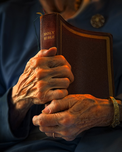
‘Enduring Comfort’ – General Merit 2009
‘Variations on a Theme’ – Loan Collection 2006
‘135 Painted Cliffs’ – Loan Collection 2007
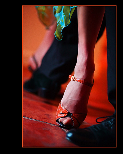
‘Tango Toes’ – General Merit 2007
I tend toward more of a commercial and fine art imagery in my business so these may be a little more ‘arty’ than other people’s entries. I’ll share a video showing most of my submissions from 2005 through 2015. Not all images made it to the merit category, but it will give you a good idea of my body of work over the years.
Bob Coates Photography IPC entries 2005-2015 (3:14)
Again I highly encourage everyone interested in improving their photography in an accelerated manner to participate in International Photographic Competition. Even if you did not enter this year spend some time streaming the IPC starting on Sunday, July 31 and continuing thru Wednesday, August 4th.
Questions, comments and other points of view always welcome.
Playing with my Lumix GX8 in panorama mode is a fun time. Being able to have a panoramic image of the scene in front of you stitched in-camera can be a great help. Sometimes these are all I need. Sometimes there can be a bit of a ‘hitch-in-the-giddyup’. Let’s look at the good, the bad, and the sometimes ugly and how to make the best use of all of them.
Sedona, Arizona red rocks – All panoramas were captured with Lumix GX8 in panorama mode
Here’s the same view with a different amount of foreground
Sometimes a panorama gives you the field of view you are looking for, but its height is just not quite right. Then it’s time to do another row and stitch them together in post-production.
When making in-camera panoramics proper technique is imperative. I learned an old videographer’s trick that makes for better captures. Point your feet where you would like the panorama to end. Place the camera against your forehead and lock elbows down to the side. Use your stomach muscles to rotate the lens to the start of the pano. Press the shutter and use the stomach muscles to turn to the end of the image. With in-camera images, I recommend going past where you wold like the final part of the picture to finish because the image will cut off a little before it appears to in the viewfinder. There’s a ‘Goldilocks’ speed for the rotation. You don’t want to go too fast or too slow. You want to move ‘just right’ to help the camera give you a good image. If it is radically wrong, the camera will notify you that it can’t process the image because of processing errors.
Poor technique led to lines captured in the image. It’s important to play your panorama back to ensure you’ve achieved a good result. It can sometimes show OK with a quick glance. I will often shoot the scene a couple of times to make sure I’ve got a good clean result.
Panorama in silhouette. I saw this scene developing in the distance and stopped the car the first chance I could. I used MacPhun’s Intensify plugin* for Mac to help bring the scene back to what had attracted me to make the image. By the time I was able to pull over the sky had started to lose its color. The software brought back the sky as it was moments before.
We have incredible tools at our disposal in the photographic world. I enjoy learning how to push them to the next level.
How about you?
Yours in creative Photography, Bob
* Special deal on MacPhun’s Intensify and Uplet (a software for uploading images to Instagram from your computer)
Professional Photographers of America (PPA) has an incredible member benefit known as International Photographic Competition. I feel that this one benefit has been worth the price of PPA admission and has helped me develop the photography skills I have today.
Sandhill Cranes – Artist entry from last year – General Collection Merit Image
I do believe there can be a misconception of what this is all about because of the name. The word competition can scare off a lot of folks. It gives them the opportunity to give excuses. “My work is not ready to compete.” “I don’t need to compete and win awards to validate my skills.” “I’ll never win.” And other similar thought patterns that keep them out of the game. I can tell you when I first started my work was, how you say, less than stellar.
YOU DO NOT GET INTO PHOTOGRAPHIC COMPETITION TO WIN AWARDS! Notice that the caps lock was on for that last sentence because it’s supposed to sound like I am shouting. Yes, awards can be a sterling byproduct of imaging competition, but that’s not why you compete. YOU COMPETE TO BECOME A BETTER PHOTOGRAPHER! I see every photographer that gets into image improve their work in a relatively short period. Those that put it off tend to stagnate and their progress is much slower.
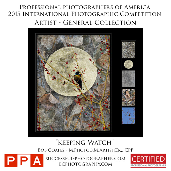
Keeping Watch – Artist entry from last year – General Collection Merit Image
The act of choosing your images. Working on them to remove every possible flaw you can find and putting them before a jury of fellow photographers for feedback is an incredible education. I can’t tell you the number of times I put my best work out there for comment in this process and… Well, let’s say I was less than pleased with the result. Occasionally I would even think to myself, “What the heck do those judges know? They weren’t there and didn’t know what I had to go through to create that image! My client loved it!” After a time away fro the sting of not getting the result I was hoping for wore off I reviewed the judges comments with a calmer frame of mind. And I’ll be darned! They were right. It could have been better had I taken into account the post processing, composition or capture suggestions when producing the image.
Sarasota Magazine Designs – Artist entry from last year – Loan Collection Merit Image
And that’s what imaging competition is all about, competing with yourself to become better. Each year you try to do better than the previous one. Eventually, the awards start to come, and that’s great. But, even after I attained enough merits for my Master of Photography Degree and Master Artist Degree and Imaging Excellence Award I still compete. Why? Because I am still trying to be better than, I was the previous year. Imaging competition keeps me sharp. It eeps me pushing the envelope to learn new techniques and perfect my craft. In short, it makes me a better photographer.
You can Stream the IPC and tune into the learning. You don’t need to be a member of PPA
Wanna be a better photographer? Get in the game! Don’t wait “until you are ready.” If you wait until then, you’ll never be ready. If you aren’t already in you can get an idea of what the judges are looking for in the images by watching the competition online. If you already are in you know that the International Photographic Competition judging process is coming up this Sunday, July 31 thru Thursday, August 4 and will be streamed live. Tune in when you can. There’s an education to be had by being exposed to imagery. More education as you hear the judges speak to the challenges of why they believe an image deserves to be awarded a Merit, or not.
Also returning this year will be the IPC Live broadcast hosted by renowned Florida wedding photographer and co-host of The Photobomb Podcast, Booray Perry, Cr.Photog., CPP. Each day at 10:15 am and 2:15 pm EST, IPC Live will feature live critiques, interviews with the judges, and live Q&A sessions.
If you have any questions about the process, don’t hesitate to get in touch with me. Happy to help you.
Heather Michelle Chinn – AKA “Heather the Painter” Corel Painter Master Elite, Corel Certified Painter Educator, Golden Artist Educator, M.Photog, M.Artist, CR.
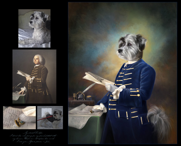
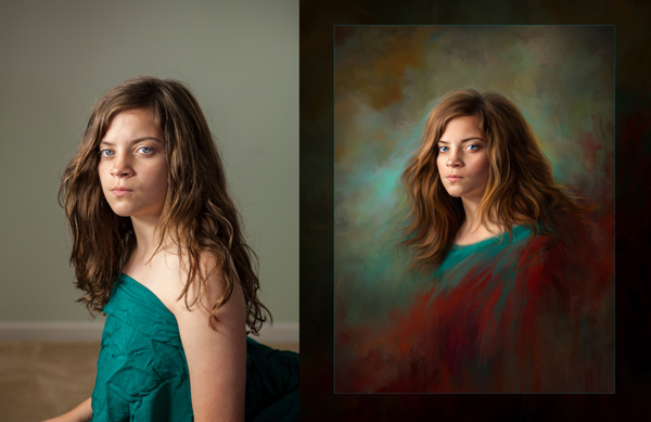
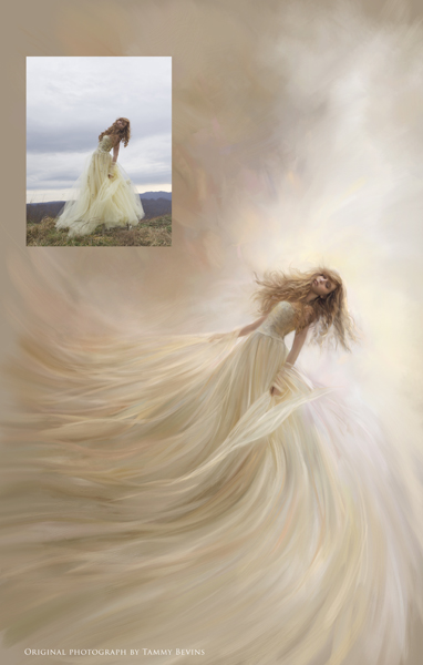
Completely captivated!
Came across the first image in this post when I was judging an imaging competition for Professional Photographers of America (PPA). It was obviously in the Artist category, but it was such a fantastic portrait that contained an incredible personality. I loved it! Great skill was needed to make this fantasy piece believable.
I have since been exposed to more of Heather’s work, and she shows why there are so many credentials following her name. Another image, in an entirely different style, cemented the fact I wanted Heather to be featured in this blog about Painterly Photo Art. I won’t tell you which image, but know that “Leo” is one of my all-time heroes in the art world. Here’s Heather.
Learning Corel Painter
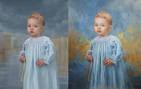
Creatives wanting to learn Corel Painter, and traditional oil/acrylic painting often ask what they can study to learn how to produce stronger paintings. Studying traditional artwork in a style that moves you is the key! Look at the same elements used to judge the International Print Competition** and you can see how it translates into a more PAINTING-focused list:
Here we go!
Impact – Does this grab the viewer/collector for a long time and stir emotions by using the following elements?
Technical Excellence – Are your brush strokes varied to a degree where not everything looks like mush, or “matchy-matchy?” How are your shadow/highlight transitions accomplished in blending or laying varying levels of colors next to each other? Is the texture interesting and supportive? Are the brush SIZES supporting and appropriate? Are objects correctly proportionate?
Composition – Does the layout of choices such as value range, lines, subject shape weights, etc. support your story? Does it keep the interest of the viewer without them knowing why?
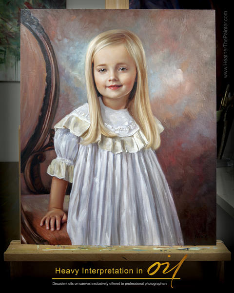
Presentation – Is it presented in a way that best supports the painting? IE: Frame choice? Hanging height with lighting choice? I rarely use thin frames, and try to find frames that are at least 4″ in width or matches the subject’s face size. Is it best presented on paper or canvas? Watercolors, pastels, charcoals, and more modern interpretations read beautifully on papers. I’ve found traditional paintings are best received on canvas. It’s up to your style and taste. Is it hung at eye level? Is it well lit?
Color Balance – I believe this is crucial to a painting being successful. If you look at well-known pieces by the Masters such as Monet’s waterlilies, John Singer Sargent’s portraits, or the brilliant works by Vermeer, you’ll see not every color in the spectrum was used. That can be overkill unless it aligns with your style (more modern). The aspect of BALANCE is of paramount importance. Are the colors overall easy to view for a long period, or does the saturation scream at you? Does the harmony and balance of colors playing together work to support the message? If you look at a Sargent portrait and take it into Photoshop and look at the colors used, you’ll find very few super saturated colors are used. Saturated colors were reserved for pops of “surprise.” Limit your “aha!” color moments for a more pleasing, easy-to-look-at-for-a-long-while masterpiece.
Center of Interest – This absolutely has to support your story. What are you trying to say to the viewer? Is it about the portrait of the face, or maybe a secret message about the surrounding props? Leading lines, lighting choices, highlight placement/shadow placement can all subconsciously lead the viewer here. Brushwork can also lead to the center of interest by refining your strokes and intensity of detail into the area you want the viewer to “land” and stay awhile.
Lighting – This absolutely must support your story, again (seeing a pattern here?). Dramatic lighting on a fresh newborn baby speaks of ominous tones or dramatic backstory. If you study the popular Old Masters paintings, you may notice two things: direction lighting (versus flat lighting), and an element of backlighting make for STUNNING paintings. Flat lighting is harder to paint, in my opinion. There is no clear definition of highlight placement. It works for some artists. For me, I tend to love clear, defined highlights that come with direction lighting, and a backlit/hair lit portrait. Is the lighting the most flattering to your subject?
Subject Matter & Story Telling – These are pretty self-explanatory! What the heck are you trying to convey in your artwork? Is it clear?
Technique – Balance your colors. Balance your brush texture. Varying degrees of blending/hard edges will make for a very interesting painting. There must be some tension of contrast between your elements.
I would recommend getting lost in art museums, gallery showings, Pinterest, Behance, and playing with paint! Take screenshots of images that move you. Put them in a single folder, and then go through this list trying to find similar elements between your favorite artwork? Do you find you’re drawn to more monochromatic paintings? More bold colors? Flat lit? Directionally lit? Strong lines, or soft, blended, peaceful scenes? Is there similar brushwork? Is there a dominant color family consistently used? Is there a consistent subject matter?
Maybe if you can find similarities, you can apply those to your masterpieces! Even if you don’t paint in your studio, when applied, these elements will grow your portraiture.
Heather Michelle Chinn was born with a paintbrush. From early on she would paint anything with any medium within reach from food to nail polish. Her earlier masterpieces were painted inside closet walls and eventually translated into professional murals in Fredericksburg, Virginia. For several years, Heather painted whimsical watercolors for the international stationary company Mon Petite Chou.
Heather is an experienced presenter in live and recorded demonstrations. She has been teaching Corel Painter and mixed media at multi-day workshops, live seminars and webinars, and PPA affiliate schools all across the country for the last eight years. Known for what is consistently called her “calming” manner of speaking, being graceful under pressure, concise and thorough, with easy-to-follow Corel Painter tutorials. Heather is a natural educator across multiple platforms.
Two of her ethereal paintings of children, “Little Miss” and “Not A Girl, Not Yet a Woman,” were featured among 135 artist’s work out of thousands of entries in Ballistic Publishing’s first Painter book. Heather’s masterpieces are consistently featured in the prestigious, annual PPA Loan Collections where only a small percentage of the world’s best photographic artwork is selected among thousands of entries. Interviews and artwork have been featured in multiple Showcase Collections, French Photography Magazine, Digital Photo Pro UK, After Capture and the Official Corel Painter Magazine. Recently, Heather’s work and collaborative efforts have been published in Painter Showcase, a collection of several worldwide digital artists’ masterpieces available at Amazon.com. Her belief that anyone can easily use Corel Painter to create their own keepsakes led her to a speaking platform at the beautiful Phoenix Symphony Hall for the Professional Photographers of America’s International Convention in Phoenix, Arizona in January 2014. Heather made her television debut on Lifetime Television’s “The Balancing Act” in April of 2014.
When Heather isn’t creating oils and mixed media paintings for her photographer clients, or retail collectors on the easel, she travels the country inspiring and mentoring the budding or professional creatives in mixed media and figurative expression. Her time is devoted and divided between painted commissions, and education. It is said that Heather’s “soul” is often very clearly seen in her work. Her elegant brushwork and transcendent color harmonies capture the ethereal essence of the subject and evoke an emotional dialogue between viewer and painting.
Be sure to subscribe to the newsletter at www.HeatherThePainterStore.com for updates on webinars and workshops! There are in-depth tutorials of step by step training on www.HeatherThePainterStore.com. Heather is available for digital painting and acrylic/oil embellishing private and group workshops, private online training, and speaking.
The top two tutorials that help people who have never used Corel Painter, or have never PAINTED before are the “Intro to Painter” and “Portrait Box Set” available for immediate digital download at www.HeatherThePainterStore.com
Deals for Successful-Photographer readers from Heather until September 1st, 2016
“save25” saves $25 off the new Classical Remixed Backgrounds Collection (even if it’s on sale)
“successful” saves you 20% off any tutorial training (even if it’s on sale)
** PS – Heather’s post comes at a great time and talks about the twelve elements as used in International Photographic Competition (IPC) Judging starts this Sunday and you can watch the process live. Fabulous education even if you haven’t entered images this time around.
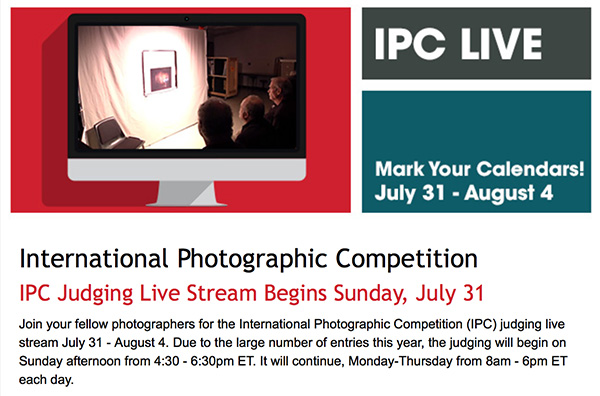
International Photographic Competition
Welcome to IPC Live, streaming July 31 – August 4, 2016. Everyone is welcome to watch! If you are a PPA member, login with your username and password. If you are not a member, create an account below, and enjoy the show! Here are the showtimes:
IPC Judging Live Stream: Sunday, July 31, 4:30 pm – 6:30 pm EST; Monday, August 1 – Thursday, August 4, 8:00 am -6:00 pm EST
IPC Live hosted by Booray Perry, Cr.Photog., CPP: Monday, August 1-Thursday, August 4, 10:15 am & 2:15 pm EST
For infrared conversion of my cameras I use LifePixel. Infrared allows you to put an older camera to use and opens up a new time time of day for productive image creation.
Learn Photoshop in a fun environment. Aaron Nace applies the right amount of fun with easy to understand and follow tutorials. Actions and brushes are included with lessons!
Best embroidery ever. Give Queensboro a try, get a $20 instant credit to get started by clicking on the logo! They specialize in great quality custom logo apparel and promotional products with the best customer service.
Platypod has become a great resource for being creative in getting your camera gear easily into unusual places. As an Platypod Pro I get to work/play with the gear even before it comes out. Head over to Platypod, subscribe to the newsletter and you will get special discounts reserved only for subscribers.

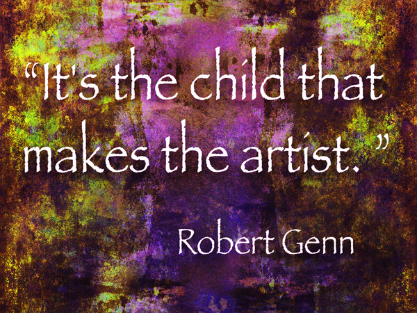 “It’s the child that makes the artist.” – Robert Genn