by successfulbob | commercial photography, LumixGH5, people photography, photography, photography gear, photography lighting resources
Go Pet Friendly – Part Two
Here’s a follow-up to the post from the other day about shooting an author’s photo and some support images for a book project. Amy Burkert and her husband Rod are on the road searching and researching pet friendly travel venues and a book is being written about traveling with pets as an addition to the Go Pet Friendly website
One of the images was the whole crew and the thirty-seven foot Winnebago with which they travel the country. Lighting conditions were a bit on the contrastly side with high sun and shade under the awning.
 Go Pet Friendly home on the road and the family that lives there.
I used two Paul C Buff White Lightning X-3200 lights to control the contrast of the scene. The main light was fitted with a thirty-six-inch Octabox and the other was used for fill with a thirty by sixty inch foldable softbox camera right. A couple of braketed exposuers were made to get a lighter exposure on the tree that was in shadow to bring back some detail that would have blocked up otherwise.
The lights were powered with Paul C Buff Vagabond Mini battery packs. Portable power comes in very handy on location as it keeps from dealing with cords. It makes it easier to position lights exactly where you would like them to be.
Amy also wanted to show off her ‘children’ Ty and Buster.
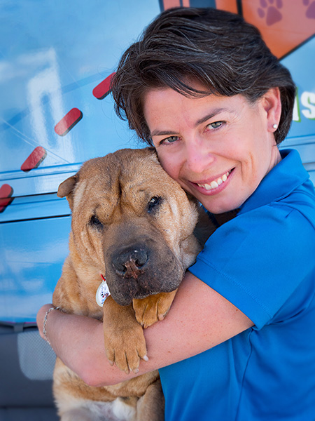 Amy and her dog Ty pose for a portrait
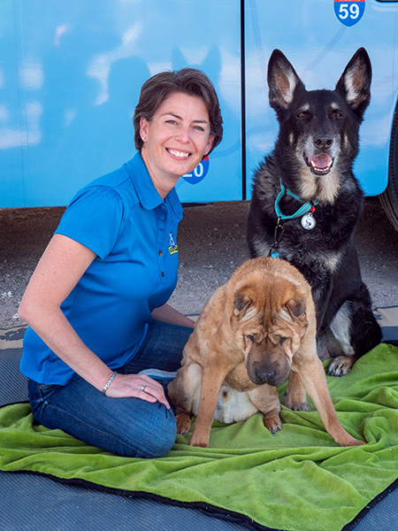 Amy, Ty and Buster pose in front of the RV
Images captured with the Lumix GH5 and the Leica 12-60mm G LEICA DG VARIO-ELMARIT PROFESSIONAL f2.8-4.0 lens
Yours in Creative Photography, Bob

by successfulbob | commercial photography, lighting, LumixGH5, photography lighting resources
Go Pet Friendly – Book Session
I don’t often share my commercial work on Successful-Photographer. I probably should.
So I will.
I received a call from a pleasant voice asking about a photography session for a book cover. Images needed would include an RV, two people, and two dogs. The owner of the friendly voice is named Amy Burkert. She and her husband Rod have been on the road for about six years traveling the country in an RV, looking for pet-friendly places and sharing their findings via their blog https://blog.gopetfriendly.com
The main photo Amy for which Amy was looking was her back cover author’s image. Especially for the book, she has written, the image should make her appear open, friendly, and inviting while telling a bit of her story. I always ask plenty of questions before coming up with a plan for the capture.
What is the layout of the book? Do you need a horizontal or vertical photo/ Have you considered your wardrobe? What background would you like to have, studio or environmental? What story do you wish to convey?
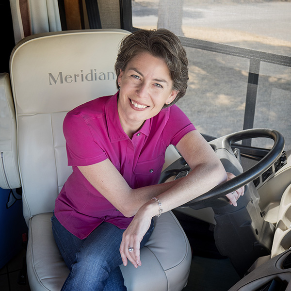
 Amy at the wheel of the thirty-seven foot Winnebago
After all the questions were answered, we ended up with Amy behind the wheel as she does most of the driving while they are on the road. There wasn’t a lot of room for supplemental lighting which made me reach into my bag for LED lighting bricks from Fiilex. With three of the bricks, I was able to add some fill light and get some background separation. These battery operated lights are color and brightness tunable and can be tucked into tiny spaces.
I choose a high angle from which to shoot to enhance Amy’s friendly and open feel. When the subject is looking up in an image it makes the viewer feel they are looking down on the person. It didn’t hurt that the camera likes Amy and she was entirely comfortable in front of the camera.
I supplied a horizontal and a square version of Amy’s portrait. Additional support images were made of the RV with Rod and the rest of the crew including the two dogs Ty and buster which I’ll share in a future post.
Images were made with the Lumix GH5 and the Leica 12-60mm f2.8-4.0 Lens
Yours in Creative Photography, Bob

by successfulbob | LumixGH5, photography, photography gear, photography software
Football and the Lumix GH5 – Part Two
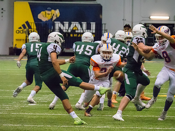
Check the previous post on my first trial photographing sports with the Lumix GH5 and the Lumix G Leica DG Vario-Elmarit 100-400mm lens. This is an incredible combination. In the images shown yesterday, the ISO was set to 6400, and I found some of the photos didn’t quite have the stopping power for which I was looking.
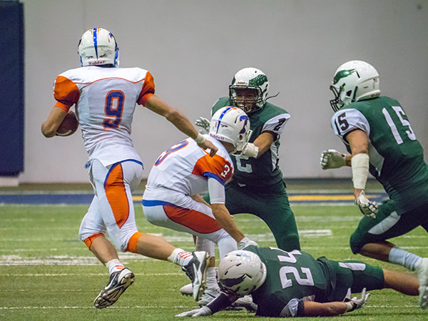
I cranked up the ISO to 12,800. WOW for stopping power, but there was added noise. The great thing is the noise can be handled in post-production pretty easily with reliable results.
 Image photographed at ISO 12,800! Lumix GH5 with Lumix G Leica DG Vario-Elmarit 100-400mm lens (200-800mm 35mm full-frame equivalent)
 Image photographed at ISO 12,800! Lumix GH5 with Lumix G Leica DG Vario-Elmarit 100-400mm lens
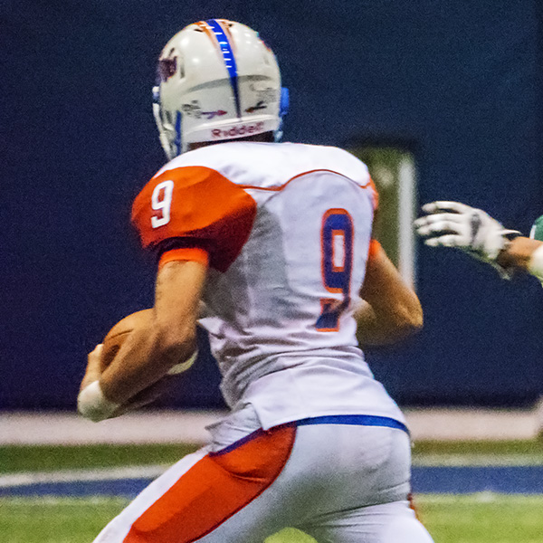
Setting the camera to IS) 12,800 gave me enough shutter speed to stop the action. The noise was heavy, but I didn’t find it objectionable because of the lack of anti-alias filter. This makes the noise more like the days of film. It’s a very organic feel.
 Here’s a small section with the noise from 12,800 ISO. Very organic but possible a little distracting for some.
 Here is the same section of the image with MacPhun’s Noiseless CK filter applied. Either image prints well but many prefer the noise reduction version.
MacPhun has changed their name to SkyLux as they are putting together versions of their software for the PC world as well as MAC machines. Here’s a link to pre-order LUMINAR with a discount. See more info below.
Yours in creative Photography, Bob
Luminar 2018 offers everything a modern photographer needs for photo editing, including new filters powered by artificial intelligence, significant speed improvements, a dedicated RAW develop module and a forthcoming in 2018; digital asset management platform.
Users will also benefit from the new intelligent Sun Rays filter, LUT support, and real-time noise removal. With workspaces that match different styles of editing, Luminar adapts to deliver a complete experience that avoids clutter and complexity.
Luminar 2018 has been re-built from the ground up for dramatic performance boosts. Existing filters deliver more vibrant colors and depth in less time. A brand new streamlined user interface speeds up working with presets, filters, and masks. With the full support of pro options like layers, masks, and blending modes, complex repairs and photo composites can be easily accomplished.
Luminar 2018 will be available for pre-order November 1-15, and released on November 16.
Pre-Order Pricing:
Current users of Luminar may upgrade at a special pre-order price of $39 ($49 MSRP)
New users can purchase Luminar 2018 at a special pre-order price of $59 ($69 MSRP)
A collection of bonuses will also be included with every purchase.
Beta testers are eligible to receive an additional $10 discount
Pre-Order Bonuses:
A Pack of signature presets and textures fro pro photography Nicolesy
An Exclusive pack of LUTs
1-Year Power plan from SmugMug ($72 value). For new accounts only

by successfulbob | black & white, fine art portrait, Lumix Lounge, LumixGH5, people photography, photography, photography gear
Post Processing on the Portrait of Ernst
One of the great pleasures of traveling to speak to photography groups is the fellowship with photographers. I met Ernst Ulrich Schafer while at the PPW Conference in Yakima, Washington. Ernst and I went out on an adventure and had a blast getting to know each other.
I asked Ernst to take a moment to pose for me to make a portrait. Found a decent spot for a nice lighting pattern on his face but the final portrait was completed in post-production. Here is the story of ‘The Making of Ernst”.
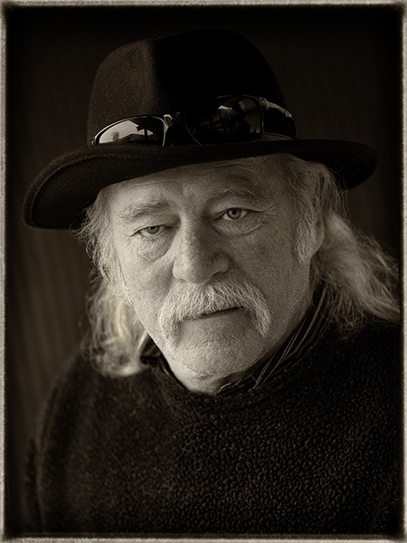
 Final image of Ernst
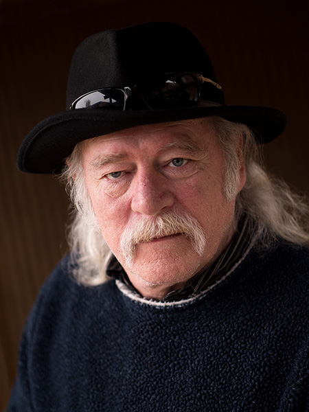
 Original capture. Looking for a soft split light pattern.
I looked for a background that had a little bit of a gradient and a soft shadow transition from light to dark. Accomplished but finding an overhead light block with two open sides. I placed Ernst closer to the left-hand side to make the short side of his face the lighted portion. The light coming from the other side worked as fill. If aI wanted a sharper contrast I would have moved him further left. Less contrast further right. Since we can’t move the lights in a situation like this moving the subject is the only way to go.
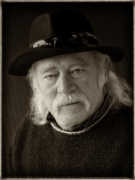
 Process in NIK Silver FX Pro 2 with Sepia Tone. Note the difference between this image and the final at the top of the page. The white rim on the collar was removed as it was a distraction. Additional dodging and burning was done to lightly increase contrast and control some of the highlights. Check out the Layers Palette Screen Capture for more details.
If you don’t already have NIK filters be aware that they are a free download from Google. There is a great variety of filter effects available in the Suite. I often use Silver FX Pro 2 for my black and white and sepia tone conversions.
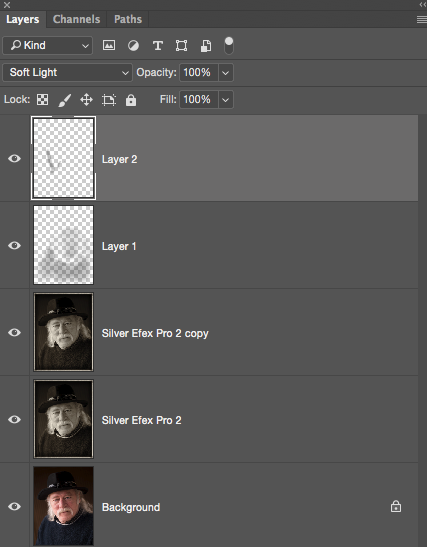
 Layers Palette
Background is the original capture. Silver Efex Pro 2 is the Sepia Tone conversion. The copy Layer shows some retouching with the removal of the white collar. Layer 1 is a Soft Light Layer to burn in the sweater and add contrast to the shadow side of the face. Layer 2 is another Soft Light Layer to control some highlights and add a little sparkle to the eyes. I use the Soft Light Layer Mode to dodge and burn my images.
As you can see Adobe Photoshop with a pit stop in Adobe Camera Raw is a large part of my workflow.
Image made with the new Lumix GH5 and the 42.5mm f1.2 Nocticron lens @f1.2 1/320th sec ISO 200
Yours In Creative Photography, Bob
Save
Save
Save

by successfulbob | inspiration, photography, photography creativity, tuesday painterly photo art
Tuesday Painterly Photo Art – Dan McClanahan
For this Tuesday edition of Painterly Photo Art I have Dan whose work I have admired for quite a while.
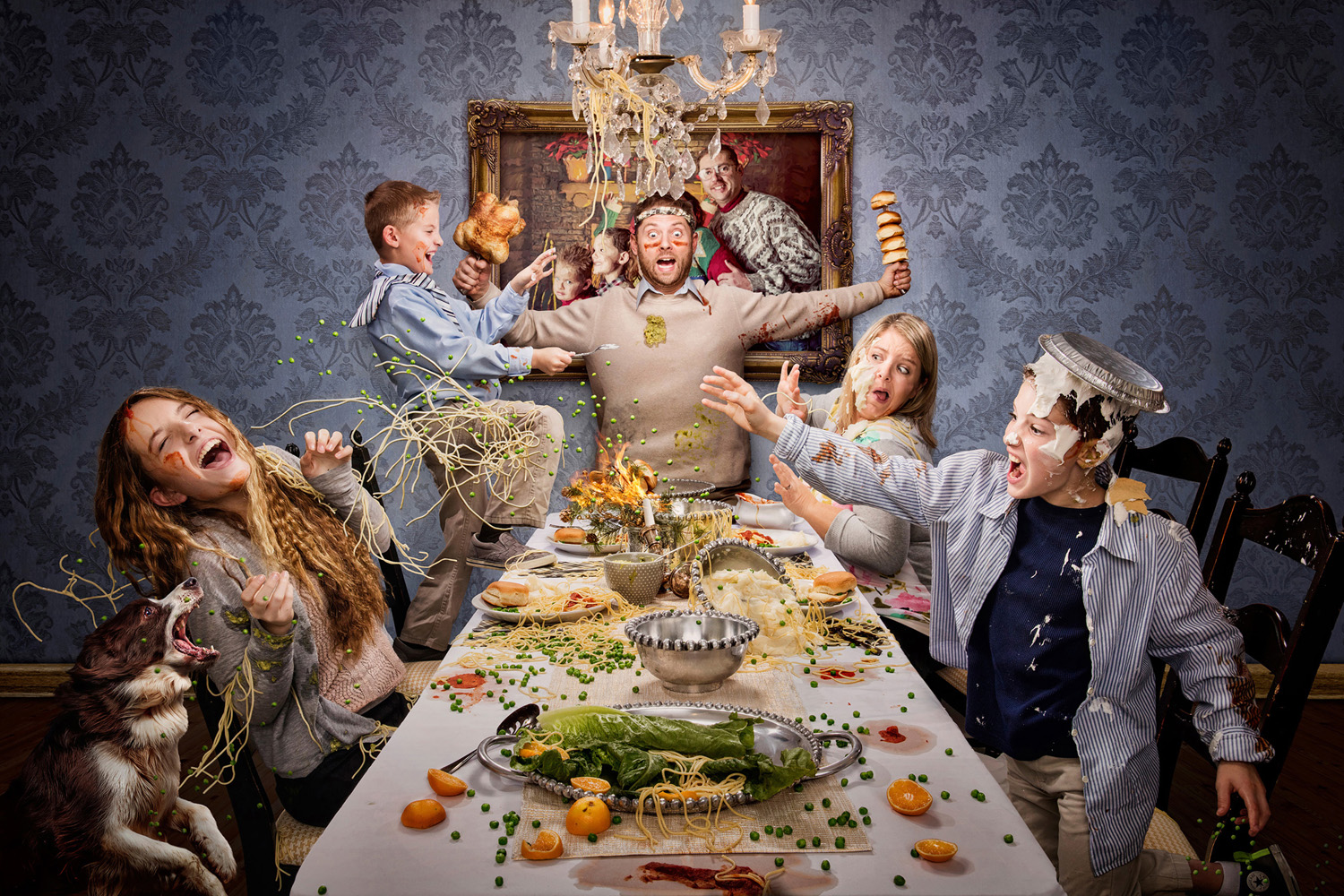
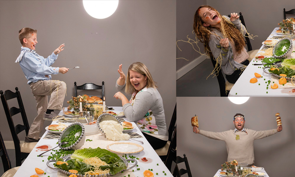
 Dad Started It! This piece was photographed in my client’s garage, capturing each subject’s expression from a tripod and stacking them together in photoshop to create an ideal composition. The food was all real, but the background was manipulated to look like a dining room instead of a garage. © Dan McClanahan
 Before images for Dad Started It.
Dan’s work is a mix of in-camera artistry using artificial lighting and photorealistic compositing, often with a fun and vibrant feel. He’s only been a shooter since the digital age, so progressive lighting and digital manipulation have always been a part of his work. Dan’s business is split between his portrait studio and commercial work, and you can see the influence of commercial lighting and sheen in his portrait work.
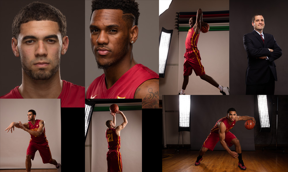
 Sports Poster – Basketball © Dan McClanahan
 Reference images for sports poster. © Dan McClanahan
“My inspiration is generally gleaned from my clients, so my concepts are a collaboration between me and them within the parameters set by their needs. My challenge is to see how technically interesting and creative I can get within those parameters. Beyond client work, I try to challenge myself a couple times per year to create something I have no idea how to pull off just to make myself learn how to do it. Our Christmas cards and my annual schedule poster for the Iowa State Cyclone basketball team are examples of this. Aside from being great learning experiences, these personal challenges generally reciprocate in the form of successful competition prints and great exposure for my brand. For example, the image above of the family having a food fight was commissioned by a mom that saw our crazy/fun Christmas cards and wanted something like that for her family. I’ll take it!

Commercial photography created by McClanahan Studio in Ames, IA. Des Moines photographers specializing in modern, creative imagery for marketing and advertising campaigns. Dan and Alex McClanahan create promotional photography throughout Iowa and all over the midwest.
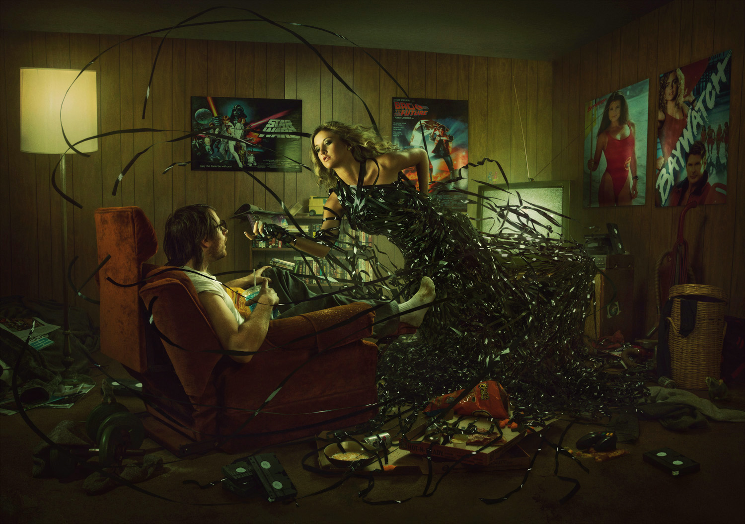
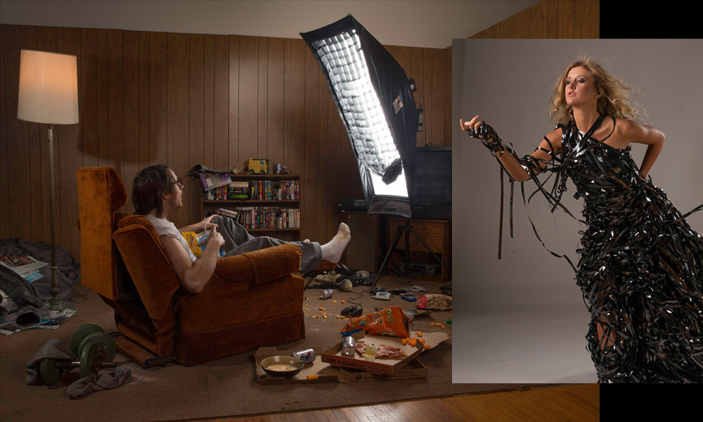
 The Dangerous Lure of Entertainment: This was a personal piece. I had a tenant that was a hoarder and left a lot of weird stuff behind when she moved out. I ended up building this set out of her possessions and visually portraying the danger of our culture’s over-addiction to entertainment. It’s something I have struggled with in the past, and I knew people that dropped out of college due to video game addiction. I set the scene in the early 90’s because VHS tape looks way cooler than DVD’s and it was fun to pull some of my childhood interests and possessions in as props. © Dan McClanahan
“I’m not adept at drawing or painting like many of my peers, so when I composite I tend to photograph my components with precise lighting to match the scene so that the layers come together naturally and don’t require much blending in photoshop. I tend to use shapely lighting setups that retain the full dynamic range of the subject while sculpting expressions and textures to look 3-dimensional in a way that is coherent to the scene. Rim lights and fill lights are often used in addition to a key light to create this look. Remember, it’s easy to add contrast in post-production, but it’s tough to fix a photo with blocked up blacks or blown out highlights.”
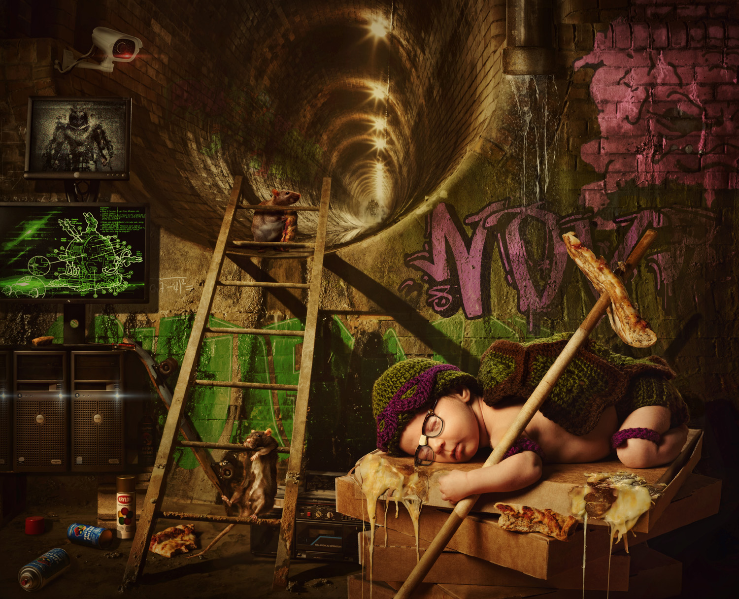
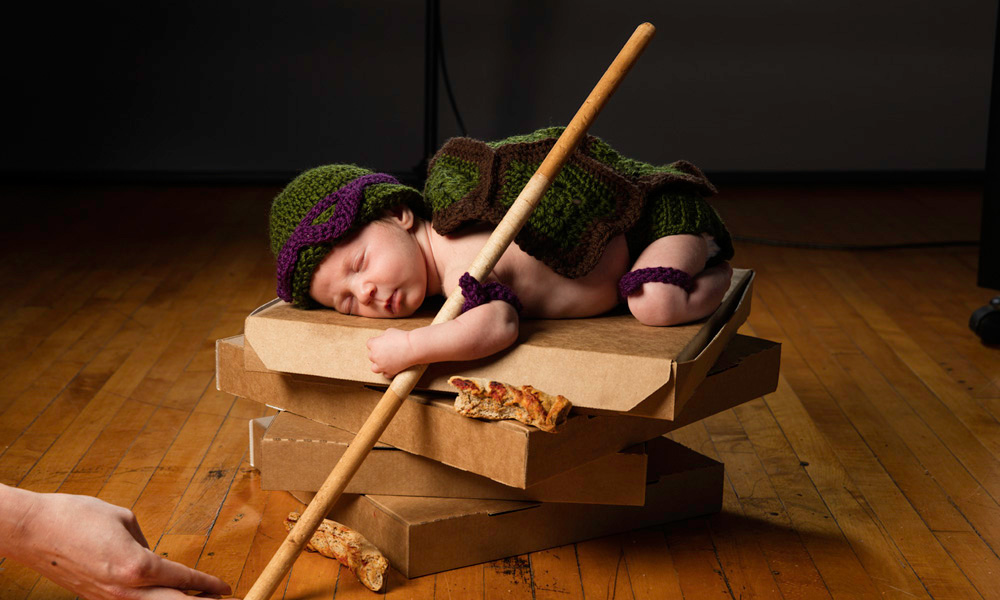
 Newborn Mutant Ninja Turtle: I recently became a father and while we hired out our newborn photos to someone with much more expertise than myself, I still wanted to make a newborn portrait “Dan Style.” I mixed several favorites of my wife and me: Teenage Mutant Ninja Turtles, crochet, my father’s glasses, my old boom box, and our favorite local pizza. I figure I better subject my daughter to all of my favorite childhood things in photos before she’s too old to object. © Dan Mcclanahan
Before image. © Dan McClanahan
Dan McClanahan became a photographer in 2009 with the goal of creating a fresh alternative to traditional photography in his market. His quest was so successful that his work quickly made waves in the photo industry with multiple Grand Imaging Awards from Professional Photographers of America (PPA), Wedding and Portrait Photographers International (WPPI) awards, magazine features and becoming one of the youngest photographers on record to receive all three photography degrees bestowed by PPA. Dan has given back to the photography community as an educator, teaching numerous times at Imaging USA, SYNC, After Dark Education, PhotoVision and other events.
He owns and operates McClanahan Studio with his best friend and beautiful wife, Alex. He splits his time between advertising photography and high school senior photography. The couple live and work with their daughter in a twelve thousand square foot historic building they renovated and share with nine tenants.
Outside work Dan is a small town Iowa introvert that loves Jesus, his family, punk rock drumming and strong coffee.
See more of Dan’s work –
http://www.mcclanahanstudio.net
https://www.instagram.com/danmcclan
https://www.facebook.com/mcclanahanstudio
https://twitter.com/McStudio
Dand and Alex will be hosting a photo retreat in June in Hawaii – for more details
http://createdbykaui.com/photo-retreats-hawaii/retreat-details/june-6-9-2017-mcclanahans-hawaii-retreat
Save
Save
Save
Save
Save

 Go Pet Friendly home on the road and the family that lives there.
 Amy and her dog Ty pose for a portrait
 Amy, Ty and Buster pose in front of the RV

