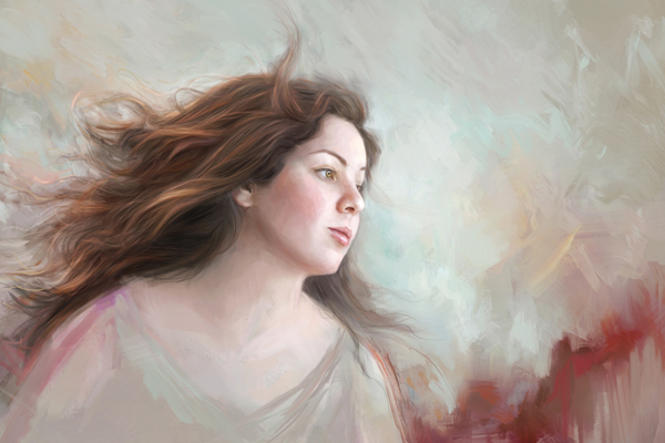
by successfulbob | fine art photography, fine art portrait, people photography, photographer profile, photography, photography creativity, tuesday painterly photo art
Tuesday Painterly Photo Art
Angela Blankenship – M.Photog., CPP
Angela came to my attention as a recommendation* from a past featured artist, Heather Michelle Chinn. When I went to look at Angela’s work on her website I was immediately taken with more the painting techniques. Entranced by the pure emotion, I saw coming through in her work got me to get in touch with an invite to the blog.
‘Words of Painterly Wisdom’
The only words of wisdom I have is LEARN, LEARN, LEARN.
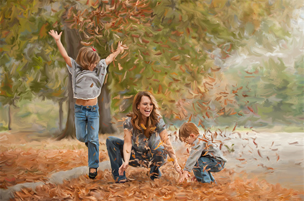
 I love the movement and family connection portrayed in this portrait by © Angela Blankenship
Seek out someone, or couple people, whose work you appreciate and ask them to help you develop your own vision through the skills they have and can pass on to you. I spent time with some fabulous digital painters, Mona Sadler – Coastal Pet Portraits and Heather Chinn – Heather the Painter, who were gracious enough to help me begin and develop the skills needed to be able to create merited work. I had merited images at IPC within a year of learning to digitally paint.
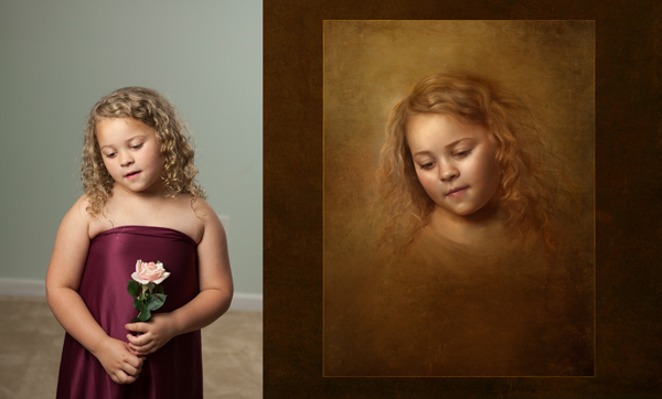
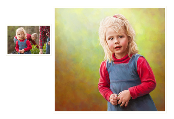 Before/After ‘Such a Bright Child’ © Angela Blankenship
Nothing replaces one-on-one teaching. I also suggest bringing as many of your ideas and vision to the “teachers” so they can help YOU create YOUR OWN style and art pieces. Tear out images in magazines you love. Hang them on your wall and start to see the similarities in the work to which you are attracted. This can help you notice a style and assist the mentor to guide you in the skills needed.
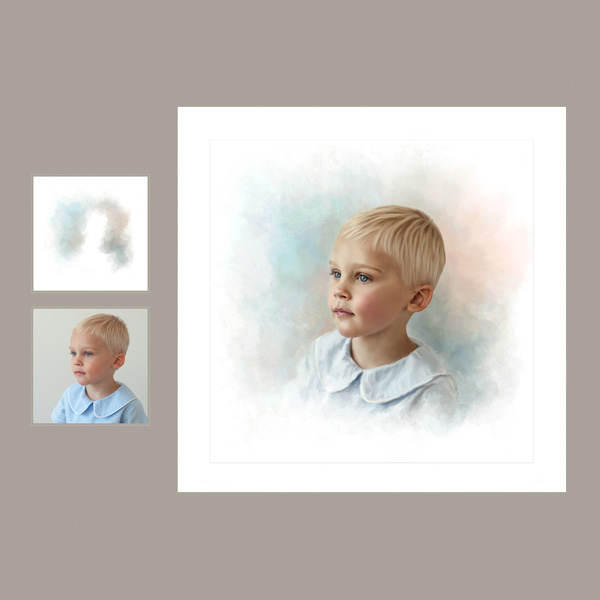 Heirloom Petite Portrait Before/After ‘Dreamy’ © Angela Blankenship
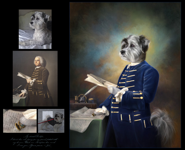
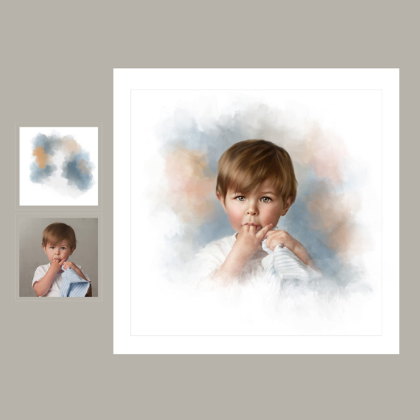 Heirloom Petite Portrait Before/After ‘Protected’ © Angela Blankenship
I always knew I wanted to create portraits that went beyond a straight photograph. I don’t think I’m fully at my potential, but am thoroughly enjoying the process of getting there, thanks to the help of some giving teachers. I will be forever grateful to them. I remember I got teary-eyed with appreciation after my first lesson with Mona, who taught me basics to get started using Photoshop for digital painting. Heather helped me bring my vision of hand-tinted and styled headshots to life which has brought me clients that I would not otherwise have had along with some excellent sales. These images are sold and marketed under the banner Heirloom Petite Portrait www.HeirloomPetitePortrait.com
 Walk in the Woods © Angela Blankenship
Don’t be afraid to ask that special artist to help you develop your work.
www.abphotography.info Angela’s main website
www.HeirloomPetitePortrait.com (my website for the Heirloom Petite Portraits)
Angela Blankenship
Bio…
Energetic and driven are words that describe Angela. With five kids, 20 years as a full-time psychology professor, Certified Professional Photographer and a Master Photographer degree which was earned in four years, Angela is definitely focused. Angela owns AB Photography, a portrait studio established in 2008. Currently located on the main street of quaint downtown Nashville, NC. She is dedicated to creating classic children’s portraiture.
Angela’s Mentor’s websites
www.heatherthepainter.com Heather Chinn website
www.coastalpetportraits.com Mona Sadler website
Yours in Creative Photography, Bob
* Do you have a recommendation for an artist you believe would be appropriate for this Tuesday Feature? Let me know!
Save
Save
Save
Save

by successfulbob | art books, inspiration, photography books, photography creativity, tuesday painterly photo art
Tuesday painterly Photo Art – Julianne Kost Part 2
Julianne keeps pushing in new directions. In
In Part One of Julianne in this blog, we spoke of her Adobe Photoshop Evangelism which is her primary job. No that’s not a religious designation. She travels around the country sharing new features of the Photoshop and Lightroom programs with photographers.
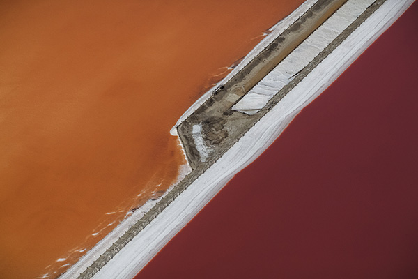
While on her travels she creates art that many of us would not think to do until we saw it. I hear the chorus of voices now. “I could have done that!!” But you didn’t. Julianne sat looking out from the window seat of jet planes traveling 30,000 plus feet in the air a got a vision of how to use that vantage point to create art and share with others how that art was created.
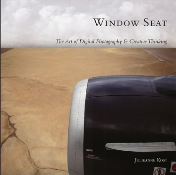
Window Seat
Kost travels about 250 days a year, and, for better or worse, she’s required to fly to get to almost all of the places she visits. As a result, Julianne spends lots of time on airplanes in those tiny, cramped seats with little to do but try to work or read.
 Window Seat Image – © Julianne Kost
 Window Seat Image – © Julianne Kost
Julianne shares the genesis of the project, “
Shooting photographs allows me to stay sane during those long flights, because what most people don’t know is that I have a bit of a handicap when it comes to flying; I am scared to death of it. I’ve always been afraid of flying, but during one particular 20-minute bout of turbulence in the middle of the Andes years ago, I found myself white-knuckled, fingers embedded in the hard plastic armrests. It was in that instant that the camera became a comforting buffer between the reality of that moment and my own thoughts.”
 Window Seat – The Art of Digital Photography & Creative Thinking
“I discovered that shooting pictures out of the plane window allowed me to view the scenery in a different context: not as the earth some 30,000 feet below, but as an immense, constantly scrolling image. As long as I could see the world as an image through an eyepiece rather than as a harsh, physical reality, the threat was less real. I became a spectator – an observer of the scene rather than part of it.”
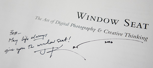
 Julianne Autographed my copy back in 2006 – The book is still valid today as a learning tool
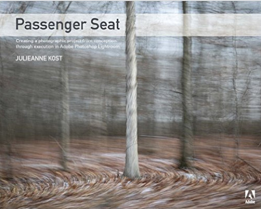
Passenger Seat
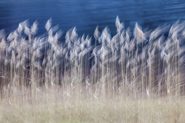
 Passenger Seat Image – © Julianne Kost
Julianne referred me to the Adobe blog site for more information on her Passenger Seat project where she was interviewed by Lex van den Berghe who is a Principal Product Manager on the Digital Imaging team at Adobe.
This will get you started on Lex’s interview…
Tell us more about how you got started with the Passenger Seat series. Where did the inspiration come from?
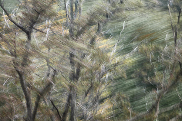
Passenger Seat, the project, started as a purely personal one as I traveled through the northeastern United States to view the leaves in fall. We drove all day looking for iconic New England landscapes, and between the small towns, I started taking images out the window of the car. At the end of the day, the images that I had made “in between” were the images that resonated with me. I found myself capturing a distinct yet ephemeral moment that was not entirely apparent or observable when the image was made, yet these photographs conveyed the mood, colors, and transient notion of fall better than anything that I had mindfully composed.
 Passenger Seat – Creating a Photographic Project from Conception through Execution in Adobe Photoshop Lightroom
With photography so often about the obsession of capturing perfect moments and frames in crystal clear focus, can you explain what it was like to create images that seemed to deliberately go against the grain of all technical and aesthetic conventions?
It was fun! I believe we need to constantly explore different techniques and subjects in order to stay healthy and not atrophy. This project helped me continue to look at things with a new perspective, photograph what I could not see, learn how to make technology work for me, and “let go” and lose myself in the process of making images.
 Passenger Seat Image – © Julianne Kost
Continue reading the rest of the Passenger Seat blog post here…
Kost Bio
Named one of Fast Company’s “100 Most Creative People in Business,” Julieanne Kost is a Principal Evangelist at Adobe Systems, responsible for fostering relationships with customers through meaningful and inspirational Photoshop and Lightroom instruction. As a highly sought-after speaker for the industry-standard Digital Imaging franchise, she devises and presents motivating and educational training sessions, sharing original techniques and tutorials worldwide — via live events, Adobe.com, her own website (jkost.com) and blog (blogs.adobe.com/jkost). She is also the author of “Passenger Seat—Creating a photographic project from conception through execution in Adobe Photoshop Lightroom” and “Window Seat — The Art of Digital Photography and Creative Thinking”, (I have an autographed copy: Ed) an accomplished photographer and fine artist, and creator and host of the popular Photoshop CC Essential Training, Adobe Camera Raw Essential Training, and the Art of Photoshop Compositing for Lynda.com.
Kost is well-known for her unique approach to instruction, infusing practical tips and tricks with an equal amount of humor and creativity that keeps audiences entertained and engaged. She often serves as a guest lecturer at distinguished photography workshops, industry events, and leading educational institutions around the world. She’s a contributing columnist and author for a variety of print and online publications and has created over 500 instructional videos as the host of Adobe’s “The Complete Picture” featuring Lightroom and Photoshop, serves as producer and instructor of the “Lightroom Getting Started” and “What’s New in Lightroom,” training courses, as well as the “Revitalize your Workflow with Lightroom” seminar on CreativeLive.
Kost has been recognized for her outstanding service and contributions to the professional photographic industry, winning the Gerhard Bakker Award from the Professional Photographers of America, the Honorary Educational Associate Award from the American Society of Photographers and was inducted into the Photoshop Hall of Fame by the National Association of Photoshop Professionals.
The combination of her passion for photography, mastery of digital imaging techniques and her degree in psychology, makes her photographic and fine artwork familiar, yet surreal with inventive and mysterious worlds where things are not quite as they seem. Her work has been exhibited numerous times and featured on Behance.net, PetaPixel.com, thisiscolossal.com, photographyserved.com, and Photoshop.com.
Kost holds an AA in Fine Art Photography and a BS in Psychology.
Yours in Creative Photography, Bob
Save
Save
Save
Save
Save

by successfulbob | fine art photography, fine art portrait, people photography, tuesday painterly photo art
Tuesday Painterly Photo Art
Heather Michelle Chinn – AKA “Heather the Painter” Corel Painter Master Elite, Corel Certified Painter Educator, Golden Artist Educator, M.Photog, M.Artist, CR.
Completely captivated!
Came across the first image in this post when I was judging an imaging competition for Professional Photographers of America (PPA). It was obviously in the Artist category, but it was such a fantastic portrait that contained an incredible personality. I loved it! Great skill was needed to make this fantasy piece believable.
I have since been exposed to more of Heather’s work, and she shows why there are so many credentials following her name. Another image, in an entirely different style, cemented the fact I wanted Heather to be featured in this blog about Painterly Photo Art. I won’t tell you which image, but know that “Leo” is one of my all-time heroes in the art world. Here’s Heather.
Learning Corel Painter
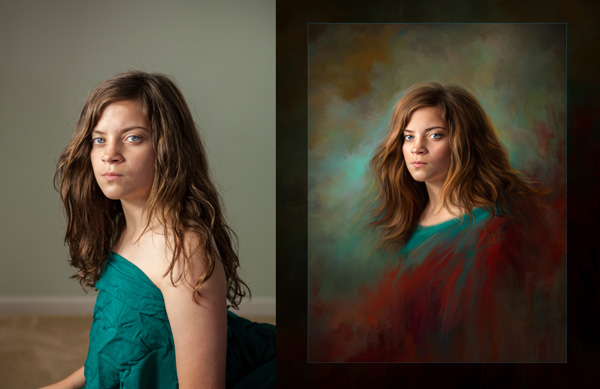
Creatives wanting to learn Corel Painter, and traditional oil/acrylic painting often ask what they can study to learn how to produce stronger paintings. Studying traditional artwork in a style that moves you is the key! Look at the same elements used to judge the International Print Competition** and you can see how it translates into a more PAINTING-focused list:
Here we go!
Impact – Does this grab the viewer/collector for a long time and stir emotions by using the following elements?
Technical Excellence – Are your brush strokes varied to a degree where not everything looks like mush, or “matchy-matchy?” How are your shadow/highlight transitions accomplished in blending or laying varying levels of colors next to each other? Is the texture interesting and supportive? Are the brush SIZES supporting and appropriate? Are objects correctly proportionate?
 “Letters to Penelope” © Heather Chinn Photography
Creativity – Is this something “new” that viewers/collectors haven’t experienced before? Is it a different take on a theme?
Style – Does your heart and soul show through your art? Is it an accurate expression of the real you? People can tell. If it’s you, it shows.
 “Defiant” before/after © Heather Chinn Photography
Composition – Does the layout of choices such as value range, lines, subject shape weights, etc. support your story? Does it keep the interest of the viewer without them knowing why?
Presentation – Is it presented in a way that best supports the painting? IE: Frame choice? Hanging height with lighting choice? I rarely use thin frames, and try to find frames that are at least 4″ in width or matches the subject’s face size. Is it best presented on paper or canvas? Watercolors, pastels, charcoals, and more modern interpretations read beautifully on papers. I’ve found traditional paintings are best received on canvas. It’s up to your style and taste. Is it hung at eye level? Is it well lit?
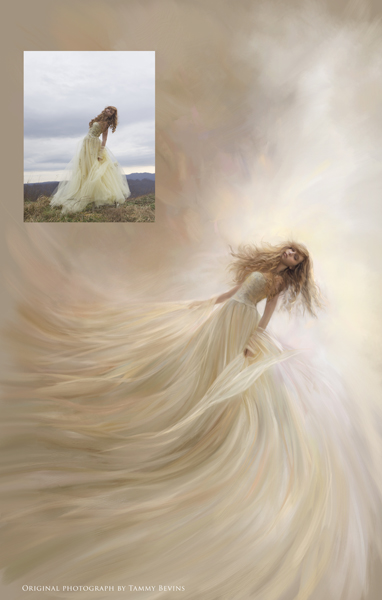
 “Elysium” © Heather Chinn Photography Original photograph Tammy Bevins
Color Balance – I believe this is crucial to a painting being successful. If you look at well-known pieces by the Masters such as Monet’s waterlilies, John Singer Sargent’s portraits, or the brilliant works by Vermeer, you’ll see not every color in the spectrum was used. That can be overkill unless it aligns with your style (more modern). The aspect of BALANCE is of paramount importance. Are the colors overall easy to view for a long period, or does the saturation scream at you? Does the harmony and balance of colors playing together work to support the message? If you look at a Sargent portrait and take it into Photoshop and look at the colors used, you’ll find very few super saturated colors are used. Saturated colors were reserved for pops of “surprise.” Limit your “aha!” color moments for a more pleasing, easy-to-look-at-for-a-long-while masterpiece.
This links to an excellent post on color theory: http://www.oil-painting-techniques.com/color-theory.html
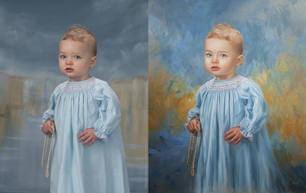
 “Culvarious” before/after marketing piece – © Heather Chinn Photography
Center of Interest – This absolutely has to support your story. What are you trying to say to the viewer? Is it about the portrait of the face, or maybe a secret message about the surrounding props? Leading lines, lighting choices, highlight placement/shadow placement can all subconsciously lead the viewer here. Brushwork can also lead to the center of interest by refining your strokes and intensity of detail into the area you want the viewer to “land” and stay awhile.
Lighting – This absolutely must support your story, again (seeing a pattern here?). Dramatic lighting on a fresh newborn baby speaks of ominous tones or dramatic backstory. If you study the popular Old Masters paintings, you may notice two things: direction lighting (versus flat lighting), and an element of backlighting make for STUNNING paintings. Flat lighting is harder to paint, in my opinion. There is no clear definition of highlight placement. It works for some artists. For me, I tend to love clear, defined highlights that come with direction lighting, and a backlit/hair lit portrait. Is the lighting the most flattering to your subject?
 “Divinely DaVinci” – © Heather Chinn Photography (This image ROCKS! ED.)
Subject Matter & Story Telling – These are pretty self-explanatory! What the heck are you trying to convey in your artwork? Is it clear?
Technique – Balance your colors. Balance your brush texture. Varying degrees of blending/hard edges will make for a very interesting painting. There must be some tension of contrast between your elements.
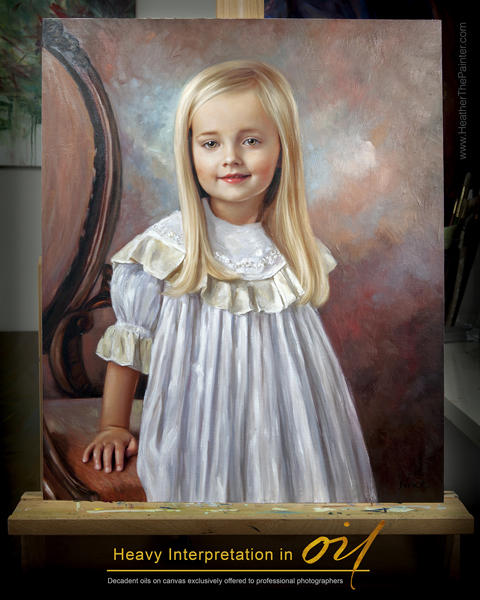
 “Oil Interpretation Marketing Piece – © Heather Chinn Photography
Heather’s Extra Tips
I would recommend getting lost in art museums, gallery showings, Pinterest, Behance, and playing with paint! Take screenshots of images that move you. Put them in a single folder, and then go through this list trying to find similar elements between your favorite artwork? Do you find you’re drawn to more monochromatic paintings? More bold colors? Flat lit? Directionally lit? Strong lines, or soft, blended, peaceful scenes? Is there similar brushwork? Is there a dominant color family consistently used? Is there a consistent subject matter?
Maybe if you can find similarities, you can apply those to your masterpieces! Even if you don’t paint in your studio, when applied, these elements will grow your portraiture.
 Heather’s Headshot – © Heather Chinn Photography
Happy painting, Heather
———————-
Heather Michelle Chinn was born with a paintbrush. From early on she would paint anything with any medium within reach from food to nail polish. Her earlier masterpieces were painted inside closet walls and eventually translated into professional murals in Fredericksburg, Virginia. For several years, Heather painted whimsical watercolors for the international stationary company Mon Petite Chou.
Heather is an experienced presenter in live and recorded demonstrations. She has been teaching Corel Painter and mixed media at multi-day workshops, live seminars and webinars, and PPA affiliate schools all across the country for the last eight years. Known for what is consistently called her “calming” manner of speaking, being graceful under pressure, concise and thorough, with easy-to-follow Corel Painter tutorials. Heather is a natural educator across multiple platforms.
Two of her ethereal paintings of children, “Little Miss” and “Not A Girl, Not Yet a Woman,” were featured among 135 artist’s work out of thousands of entries in Ballistic Publishing’s first Painter book. Heather’s masterpieces are consistently featured in the prestigious, annual PPA Loan Collections where only a small percentage of the world’s best photographic artwork is selected among thousands of entries. Interviews and artwork have been featured in multiple Showcase Collections, French Photography Magazine, Digital Photo Pro UK, After Capture and the Official Corel Painter Magazine. Recently, Heather’s work and collaborative efforts have been published in Painter Showcase, a collection of several worldwide digital artists’ masterpieces available at Amazon.com. Her belief that anyone can easily use Corel Painter to create their own keepsakes led her to a speaking platform at the beautiful Phoenix Symphony Hall for the Professional Photographers of America’s International Convention in Phoenix, Arizona in January 2014. Heather made her television debut on Lifetime Television’s “The Balancing Act” in April of 2014.
When Heather isn’t creating oils and mixed media paintings for her photographer clients, or retail collectors on the easel, she travels the country inspiring and mentoring the budding or professional creatives in mixed media and figurative expression. Her time is devoted and divided between painted commissions, and education. It is said that Heather’s “soul” is often very clearly seen in her work. Her elegant brushwork and transcendent color harmonies capture the ethereal essence of the subject and evoke an emotional dialogue between viewer and painting.
To learn Corel Painter, please visit Corel’s vast library of free tutorials at www.Youtube.com/PainterTutorials
Please subscribe to my Youtube channel at www.Youtube.com/HeatherThePainter
Be sure to subscribe to the newsletter at www.HeatherThePainterStore.com for updates on webinars and workshops! There are in-depth tutorials of step by step training on www.HeatherThePainterStore.com. Heather is available for digital painting and acrylic/oil embellishing private and group workshops, private online training, and speaking.
The top two tutorials that help people who have never used Corel Painter, or have never PAINTED before are the “Intro to Painter” and “Portrait Box Set” available for immediate digital download at www.HeatherThePainterStore.com
Deals for Successful-Photographer readers from Heather until September 1st, 2016
“save25” saves $25 off the new Classical Remixed Backgrounds Collection (even if it’s on sale)
“successful” saves you 20% off any tutorial training (even if it’s on sale)
www.HeatherThePainterStore.com and www.HeatherThePainter.com
Yours in Creative Photography, Bob
** PS – Heather’s post comes at a great time and talks about the twelve elements as used in International Photographic Competition (IPC) Judging starts this Sunday and you can watch the process live. Fabulous education even if you haven’t entered images this time around.
International Photographic Competition
Welcome to IPC Live, streaming July 31 – August 4, 2016. Everyone is welcome to watch! If you are a PPA member, login with your username and password. If you are not a member, create an account below, and enjoy the show! Here are the showtimes:
IPC Judging Live Stream: Sunday, July 31, 4:30 pm – 6:30 pm EST; Monday, August 1 – Thursday, August 4, 8:00 am -6:00 pm EST
IPC Live hosted by Booray Perry, Cr.Photog., CPP: Monday, August 1-Thursday, August 4, 10:15 am & 2:15 pm EST
Save
Save
Save
Save
Save

by successfulbob | photography, photography creativity, photography education, tuesday painterly photo art
Tuesday Painterly Photo Art
John Hartman, M.Photog.Cr, CPP, A-ASP, EA-ASP
Jealous.
If I have one word to share about John that would be it. I am jealous of his ability to absorb information and ideas about photography and photographic arts and then find a way to earn income from it. John has been sharing his photography and business knowledge for over thirty years and he’s still breaking new ground on a regular basis.
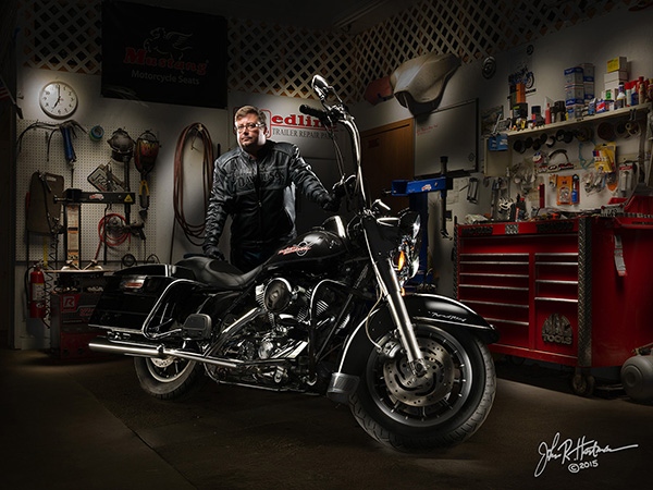
Throughout his 42-year professional career, this Wisconsin-based photographer has made it his life and business mission to find out what everyone is doing and then doing something different. One of his recent personal projects has been mastering the art, science, and business of the technique of painting with light. Exposing dozens or sometimes hundreds of separate shots with continuous LED lights and then blending them together in Photoshop, a light painted photograph simply looks like no other image.
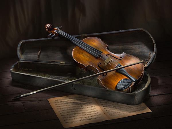
 All images in this post are © John Hartman. Light painted art.
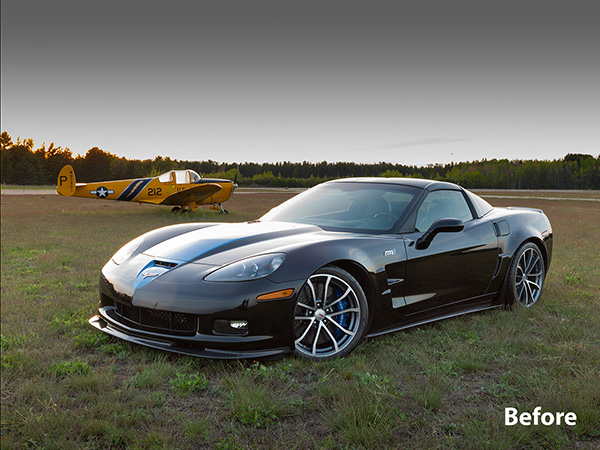
 Before Light painting
Once the process was mastered, he began testing the commercial viability of this new product. Clients have responded enthusiastically, resulting in commissions that include images up to 10 feet long and sales that often reach into five figures. Subjects include automobiles, jewelry, food, architecture, motorcycles, musical instruments, farm tractors and aircraft. His clients include corporations, collectors, hobbyists, enthusiasts and others who own and appreciate the finer things of life.
 Light Painted Fire Truck in station
  Single Capture of firehouse
One of his light paintings of a Ferrari F12 Berlinetta was chosen as a Grand Imaging Award finalist at Imaging USA in 2015, and was also included in the 2015 World Cup Photographic Competition.
Interestingly, nearly 100% of John’s light painting clients are males, who are proud of their ‘babies’ and are willing to invest whatever it takes for a unique image for their office, home, garage or man cave.
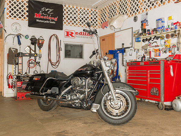
 Motorcycle Garage Light Painting
  You got it. This is before!
“The process of painting with light is neither simple nor intuitive,” says Hartman. “The high skill level required ensures the look will remain unique and will not be bastardized or diluted by a set of actions or plug-ins. The photographer willing to invest the time and effort required to become proficient in light painting can develop and retain 100% of that lucrative business in their market area.”
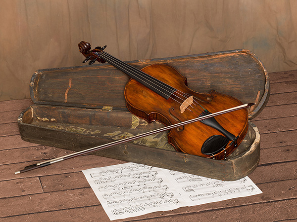
 Violin & case Light Painting
 The violin looks just a wee bit different in the before image
John is currently experimenting with an unmanned aircraft vehicle (a drone) using a mounted LED to light paint larger subjects such as buildings, landscapes and large vehicles such as farm implements and fire trucks.
You can see a short video showing him light painting a 1957 Lincoln Continental Mark II here.
Photographers have taken notice of John’s work, and requests to learn his process have resulted in a four-city tour titled The John Hartman Light Painting Workshop, to be held in his hometown of Stevens Point, WI, as well as in Pittsburgh, Seattle, and Sedona, AZ (hosted by Bob Coates). Click here for more information.
Yours in Creative Photography, Bob
Save
Save

by successfulbob | photography, photography education, photography marketing, success education, tuesday painterly photo art
Tuesday Painterly Photo Art
John Chandler, CPP & Teresa Chandler
I first saw some of Chandler’s images while judging for Professional Photographers of America. I was not aware of them at the time bu the imagery stayed with me. When I saw a Facebook post, I tracked down the website and saw more interesting imagery so I asked John if he would share some thoughts and ideas on photographic art.
I turn today’s post over to the Chandlers.
The Start
John and Teresa Chandler established Chandler Studios in 2002. Their concept was to combine John’s skills in Photography with Teresa’s skills in Oil and Pastel painting. This came at the same time Photography, as a profession, was in the “Chrysalis” phase transitioning from film to digital. Their transition was not difficult. The digital revolution kicked their business forward. This is a result of John shooting transparency film underwater for 35 years. For them to get his transparencies into a print market they had to become proficient at slide scanning and preparing the image for printing in a very young, and rapidly advancing world of Photoshop. In the 90’s Teresa had the same challenge with her oil and pastel portraits. John would photograph her portraits with transparency film and she would then color-correct each scan until she was satisfied that it was a near exact copy before printing. This early experience in Photoshop, experience with transparencies and their collective ability to review, correct, prepare and produce a printed image using Photoshop prepared them well for the digital revolution. And all of this had to be done while they were living in Japan!
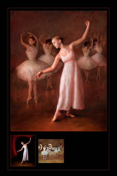
 “Dancing with Degas” © Teresa Chandler Accepted into the IPC 2015 Loan Collection.
In this image, Teresa took an image captured in the Studio during a High School Senior’s session. Using both Photoshop and Corel Teresa created this image. Her experience with painting in oils gives her a superior ability to “feel” light and textures needed to make an image like this. Corel gives her capacity to interpret the electronic brushes and then make the strokes necessary for the image to succeed.
The Team
John is the Photographer and Teresa is the finisher, and together they are Chandler Studios. They have been married for 39 years. John is a Certified Professional Photographer (CPP). Both are driven by the annual Print Competitions in their State Affiliate as well as the International Print Competition of PPA. Teresa has had three of her images in the PPA Loan Collection while John has only enjoyed one image in the General Collection. But both are avid competitors, and both are working toward Masters in Photography and Art.
Thoughts on progressing
Education is the KEY TO SUCCESS. This digital world is simply not something that will suddenly dawn on most people. You cannot “Fake it, till you Make it.” Anyone who wants to move forward in terms of sales, creativity and ability must take the time and resources necessary to get a first class education in Photography. We work in Portraits so most of our education comes from Photographers who are not only at the peak of their career but are also proven teachers. Passion is simply NOT ENOUGH. Passion plus education equals ability. We learned early in our careers that Passion does not make an artist. While passion may drive you (and drive you crazy) it does not give you ability. Education and the experience that comes with it will gives the ability to create the images that are driven by passion.
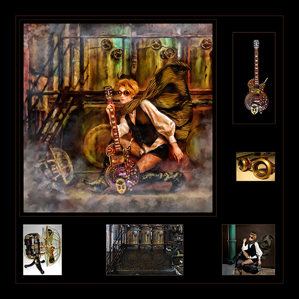
 “Steampunk Rocker” © Teresa Chandler. This composite began in the Studio and then was transformed in the computer by Teresa who used Photoshop to composite and Corel to finish giving the image its texture and contrast.
Mentorship
Can YouTube and Creative Live do this for you? Well, we think that videos can be an element, but not the only element. We feel you need to have “Hands On” kinetic learning to make the leaps needed to compete in today’s fast-changing market(s). Video learning combined with a mentor can be powerful tools needed to improve your ability. There are more workshops available today than ever before so that means that photographers have to choose wisely and ensure the workshop will move them forward and not just be a social event. We recommend a new photographer actively seek a mentor who can recommend workshops for them and guide them. This will certainly save that photographer a significant amount of money. We chose workshops with Joseph and Louise Simone, Richard Sturdivant, Tim Kelly, and most recently John Gladman. These workshops are not inexpensive. We consider them an investment in our Studio. We have also learned that cutting corners is just a waste of money.
Focus on your product.
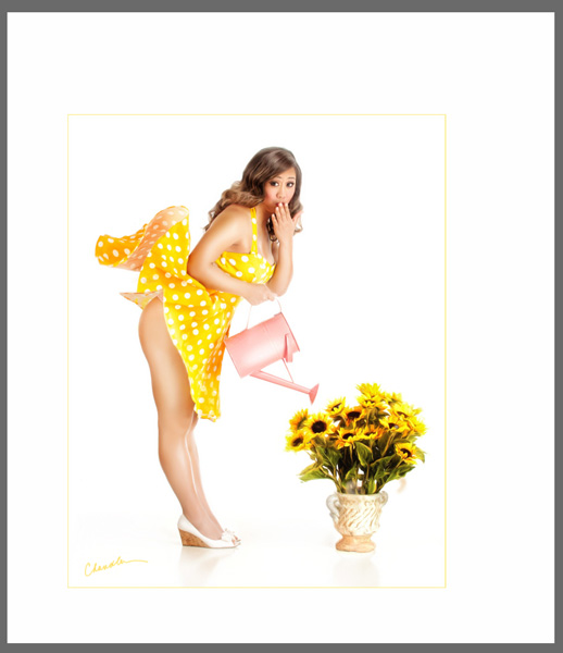
Focus on what you are wanting to produce and then produce it. Practice your skills daily. If we could say that a hundred times in this short discussion we would. Practice every day! We are in the process of re-branding our efforts in Chandler Studios by developing two new products. One is called Vintage Couture that focuses on retro PINUP. This is our approach to producing a product akin to boudoir (sexy) but still something our client can show their mom!
 This is image was selected to be in the 2015 General Collection. This is titled simply “Oops!” It was produced for a client who loved it.
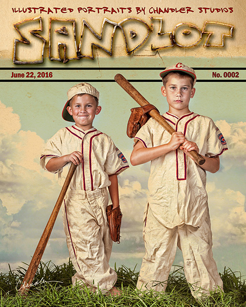
 Sandlot is our most recent image and shows another product that we are producing for our clients. We call these “Illustrative” Portraits our SANDLOT collection. This product is focused on the youth sector providing our clients a retro look in the Rockwell genre. © John Chandler
Conclusion
So that’s it. We have had a focus on Family Photography but we are now giving that a bit of a twist to give our products just a bit more. We firmly believe that education and professional affiliation is a path to success in this vocation we enjoy so much.
Our website is Chandler-Studios.com Our Vintage Couture can be on our website and at https://www.facebook.com/ChandlerVintagePINUP Our SANDLOT products are featured on our website and at: https://www.facebook.com/Sandlot-Portraits-1095078590564124
Hope you got as much out of the Chandlers sharing how they are pushing the digital envelope in their business as I have.
Yours in Creative Photography, Bob
Save
Save
Save
Save

by successfulbob | art books, fine art photography, inspiration, photography, photography creativity, tuesday painterly photo art
Tuesday Painterly Photo Art
Julieanne Kost – Adobe Photoshop Evangelist – Part One
One of my heroes, Kost, has been an inspiration from the first time I saw her give a presentation on Photoshop.
Knowledgeable, talented, giving, humble, and funny she is. I highly recommend that anytime she is giving a program near you, just go. You will be entertained as you learn tips and tricks in processing images with an incredibly powerful software program.
Let’s turn this over to Ms. Kost and start with her artist statement featuring her personal artistic work. In the future, we’ll revisit Kost featuring other facets of her work.
“In my work, I combine a passion for photography, a mastery of digital imaging techniques and knowledge gained from a degree in psychology, to construct a world similar enough to appear familiar, yet obviously, an interpretation of the physical reality that surrounds us.
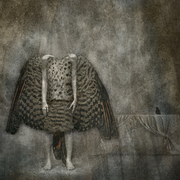
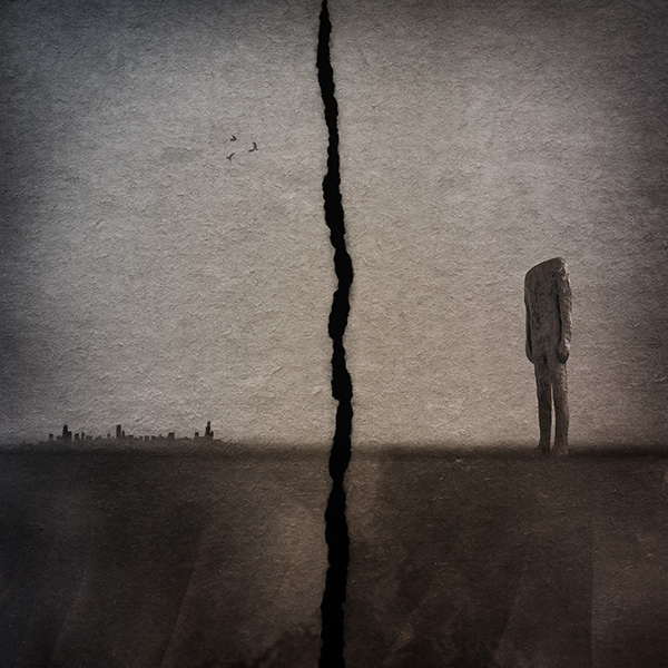
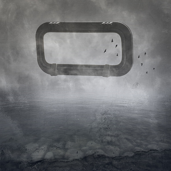
 Image ‘Untitled’ – © Julieanne Kost
Although the images are highly personal representations of my dreams and personal reality, they are abstract enough to allow individual interpretation (based on each individual’s history and life experiences). I hope to engage the viewer with the image to allow them to leave the reality that they hold true and explore, even if only for an instant, and venture into the visual placeholder of my thoughts and dreams.
Over the past 20 years I have created libraries of individual elements ranging from photographs of textures and landscapes, to scans of found objects, to encaustic paintings and charcoal drawings. Although these ingredients are not an end in and of themselves, they are waiting to take their position as a component of a larger message. The common thread is that each individual element must evoke an emotional response. What that response might be (positive or negative, comforting or confrontational) is not important at the creation stage, because how the image will be used at that point is not clear. I draw from these libraries to build images and communicate my message.
 Image ‘Two Birds’ – © Julieanne Kost
Because the components are created at different times in different locations, I find that my work falls somewhere between the more traditional photographic practice of capturing a single decisive moment and the time compression techniques used to tell a story in cinematography. In my images, I create imaginary scenes layering elements together that are unconstrained by linear time and physical location. By choosing elements that work together to form a cohesive message, I am able to create a composite image more powerful than it’s individual parts.
 Image ‘Waiting’ – © Julieanne Kost
The interactive process of selecting and assembling images is one of the most challenging and thought provoking parts of my creative exploration. Although overall, the images may appear serene and calm, the act of creation is anything but passive. I begin with a concept in mind, yet I may not know exactly how the pieces will fit together at the end. As the image takes on its own life, I often allow myself to explore additional directions, sometimes finding that the final image only faintly resembles the one first imagined.
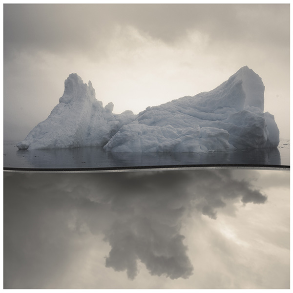
 Image ‘Perception’ – © Julieanne Kost
From a technical standpoint, I feel that a computer is not merely a shortcut for what is possible with a camera, but instead it allows me to discover what is possible in no other medium. However, with the digital realm being so forgiving and offering so many options for exploration, that discipline becomes part of the challenge. The paint is never dry, the exposure is never fixed, and the print is never final -all components can be done differently at any point. Here the art form is knowing when to stop and realizing when you’ve said what you set out to say.”
If you would like to learn more about compositing from Julieanne she has video classes available.
https://www.lynda.com/Photoshop-tutorials/Introduction-Photo-Compositing/191608-2.html
https://www.lynda.com/Photoshop-tutorials/Art-Photoshop-Compositing/147534-2.html
Yours in Creative Photography, Bob
Kost’s bio below.
Named one of Fast Company’s “100 Most Creative People in Business,” Julieanne Kost is a Principal Evangelist at Adobe Systems, responsible for fostering relationships with customers through meaningful and inspirational Photoshop and Lightroom instruction. As a highly sought-after speaker for the industry-standard Digital Imaging franchise, she devises and presents motivating and educational training sessions, sharing original techniques and tutorials worldwide — via live events, Adobe.com, her own website (jkost.com) and blog (blogs.adobe.com/jkost). She is also the author of “Passenger Seat—Creating a photographic project from conception through execution in Adobe Photoshop Lightroom” and “Window Seat — The Art of Digital Photography and Creative Thinking”, (I have an autographed copy: Ed) an accomplished photographer and fine artist, and creator and host of the popular Photoshop CC Essential Training, Adobe Camera Raw Essential Training, and the Art of Photoshop Compositing for Lynda.com.
Kost is well-known for her unique approach to instruction, infusing practical tips and tricks with an equal amount of humor and creativity that keeps audiences entertained and engaged. She often serves as a guest lecturer at distinguished photography workshops, industry events, and leading educational institutions around the world. She’s a contributing columnist and author for a variety of print and online publications and has created over 500 instructional videos as the host of Adobe’s “The Complete Picture” featuring Lightroom and Photoshop, serves as producer and instructor of the “Lightroom Getting Started” and “What’s New in Lightroom,” training courses, as well as the “Revitalize your Workflow with Lightroom” seminar on CreativeLive.
Kost has been recognized for her outstanding service and contributions to the professional photographic industry, winning the Gerhard Bakker Award from the Professional Photographers of America, the Honorary Educational Associate Award from the American Society of Photographers and was inducted to the Photoshop Hall of Fame by the National Association of Photoshop Professionals.
The combination of her passion for photography, mastery of digital imaging techniques and her degree in psychology, makes her photographic and fine artwork familiar, yet surreal with inventive and mysterious worlds where things are not quite as they seem. Her work has been exhibited numerous times and featured on Behance.net, PetaPixel.com, thisiscolossal.com, photographyserved.com, and Photoshop.com.
Kost holds an AA in Fine Art Photography and a BS in Psychology.
Save
Save
Save
Save
Save

 I love the movement and family connection portrayed in this portrait by © Angela Blankenship
 Before/After ‘Such a Bright Child’ © Angela Blankenship
 Heirloom Petite Portrait Before/After ‘Dreamy’ © Angela Blankenship
 Heirloom Petite Portrait Before/After ‘Protected’ © Angela Blankenship
 Walk in the Woods © Angela Blankenship

